

Hallways are easy to overlook because they are usually treated as spaces you simply walk through. But the right paint color can make a narrow corridor feel warmer, brighter, more architectural, or dramatically more interesting.
For 2027, hallway color ideas are moving beyond basic builder white. Warm neutrals are still useful, but earthy greens, terracotta, muted pinks, navy, burgundy, charcoal, and softly layered two-tone schemes can give these small transition spaces much more personality.
These hallway paint colors for 2027 include bright neutrals for dark corridors, moody colors for gallery-style hallways, warmer earth tones, timeless heritage shades, and practical paint treatments for stairs, paneling, and high-traffic walls.
As an Amazon Associate, I earn from qualifying purchases. This article contains affiliate links, which may earn us a commission at no extra cost to you.
Quick Picks for Hallway Paint Colors in 2027
- For a safe modern neutral: choose soft greige.
- For a dramatic gallery hallway: try deep charcoal.
- For a dark corridor: use warm white, cream, or soft yellow.
- For an earthy look: choose terracotta, olive, or mushroom-taupe.
- For traditional homes: use navy, burgundy, or two-tone walls.
- For a softer hallway: try blush, dusty rose, or blue-gray.
- For maximum drama: use forest green or black.
- For staircases: introduce one deeper accent color on the stair wall.
How to Choose a Hallway Paint Color
Hallway paint behaves differently from paint in a large living room because corridors often have fewer windows, several doorways, and changing artificial light.
Always test a large sample on more than one wall and look at it in the morning, afternoon, and evening before committing.
| Hallway Condition | Good Color Direction | Helpful Finish |
|---|---|---|
| Dark and windowless | Cream, warm white, soft yellow | Washable eggshell or satin |
| Bright with natural light | Greige, blue-gray, olive | Eggshell |
| Narrow and dramatic | Charcoal, forest green, navy | Durable washable finish |
| Historic or traditional | Burgundy, olive, cream, two-tone | Eggshell walls with satin trim |
| Modern minimalist | Soft gray, greige, warm taupe | Low-sheen washable finish |
20 Hallway Paint Colors 2027
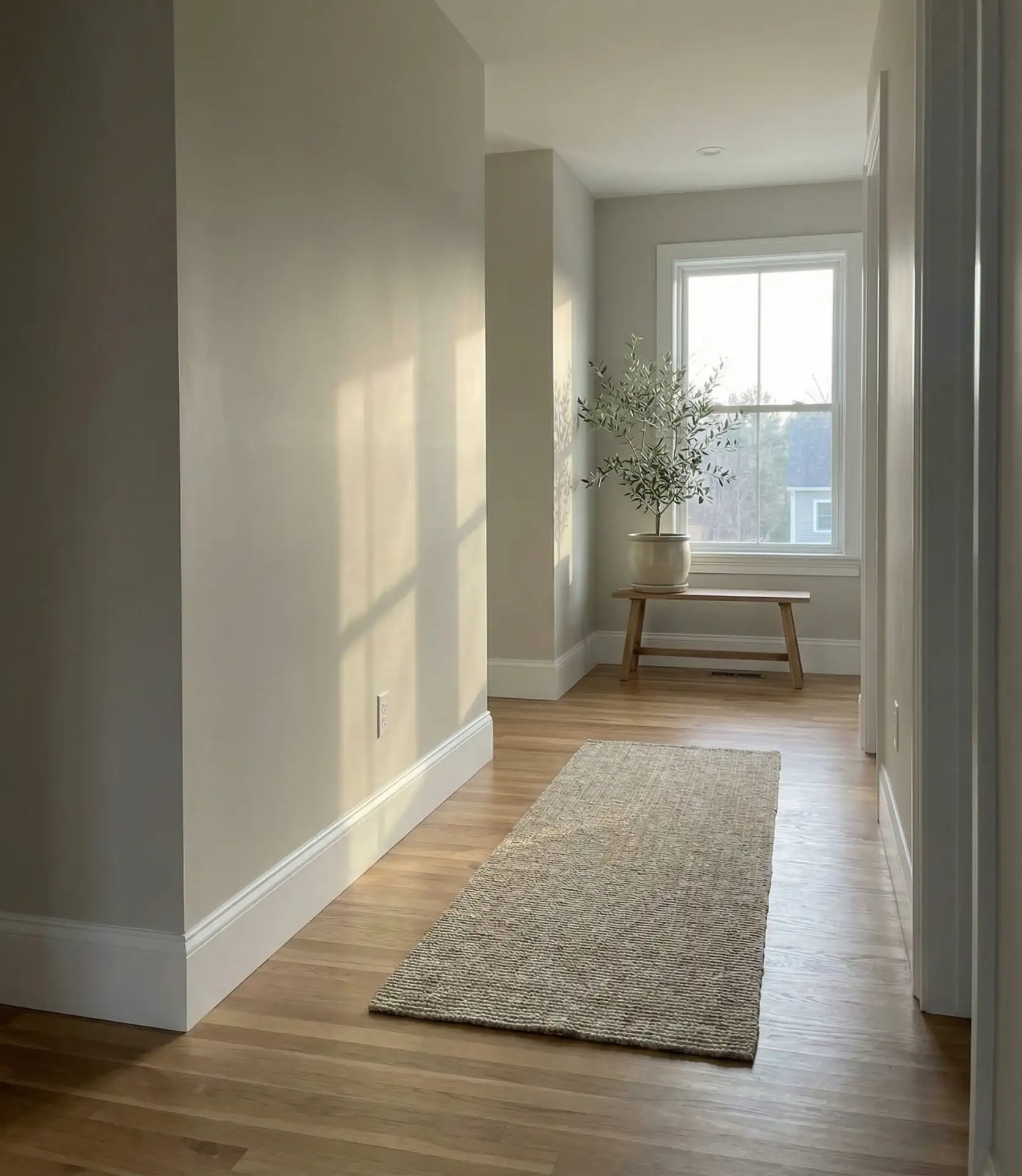
1. Soft Greige for a Modern Neutral Hallway
Greige remains one of the easiest hallway colors to live with because it sits between warm beige and cooler gray.
It can soften narrow corridors without making them feel stark, and it connects easily to adjoining rooms with different color palettes.
Pair it with warm white trim, natural oak, black frames, or woven textures for a clean modern look.
Best for: open-concept homes and hallways visible from several rooms.
2027 styling tip: choose a warmer, earthier greige rather than a flat cool gray if you want the hallway to feel softer.
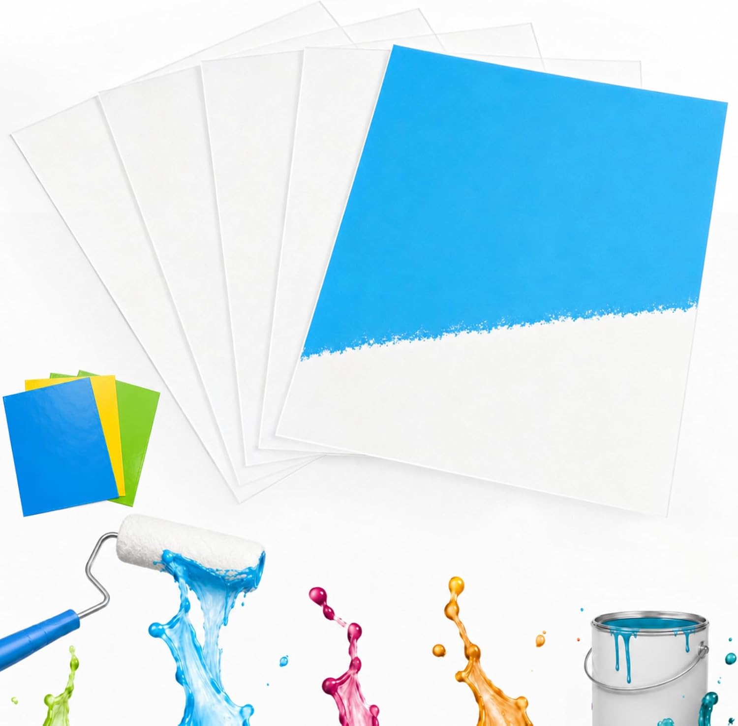
Amazon Find: Paint Sample Boards
Reusable or disposable sample boards make it easier to test hallway colors on several walls and under different lighting before painting the entire space.
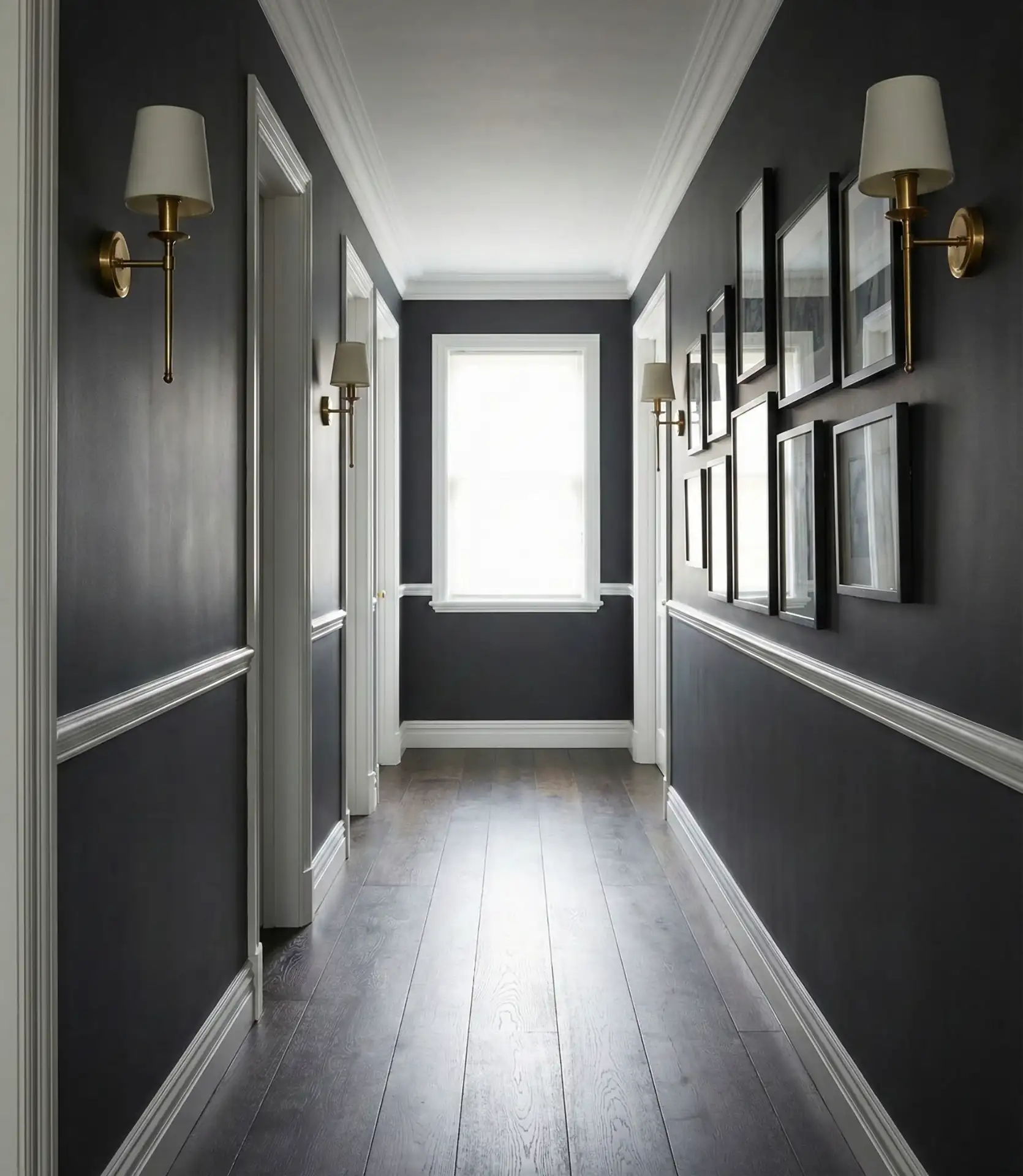
2. Deep Charcoal for Gallery-Wall Drama
Deep charcoal can transform an ordinary corridor into something that feels much more intentional.
It works especially well behind family photographs, black-and-white artwork, vintage prints, or brass picture lights because the darker wall makes lighter frames and artwork stand out.
Use warm lighting and pale trim if you want contrast, or continue the charcoal onto trim for a more enveloping look.
Best for: hallways with artwork or a strong collection of framed photographs.
If you are planning artwork along the corridor, these gallery wall layout ideas include vertical, grid, and staircase-friendly arrangements.
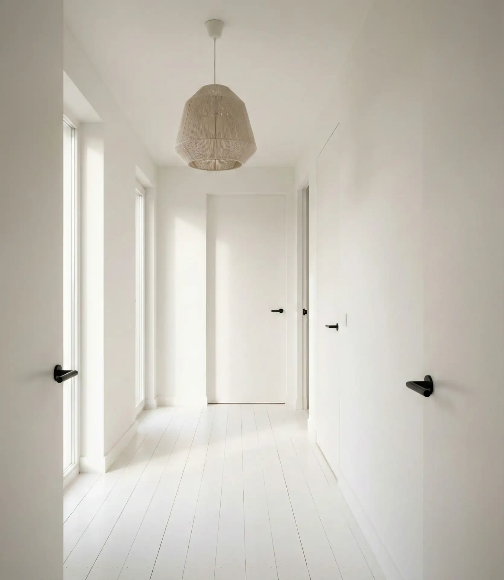
3. Warm White for Classic Brightness
White is still one of the most practical hallway colors, particularly when the architecture already provides character.
Instead of a cold blue-white, choose a warmer ivory, alabaster, or softly creamy white that works better with natural wood and warm lighting.
Warm white can highlight crown molding, paneled doors, trim, and artwork without competing with them.
Best for: narrow, dark, traditional, or heavily detailed hallways.
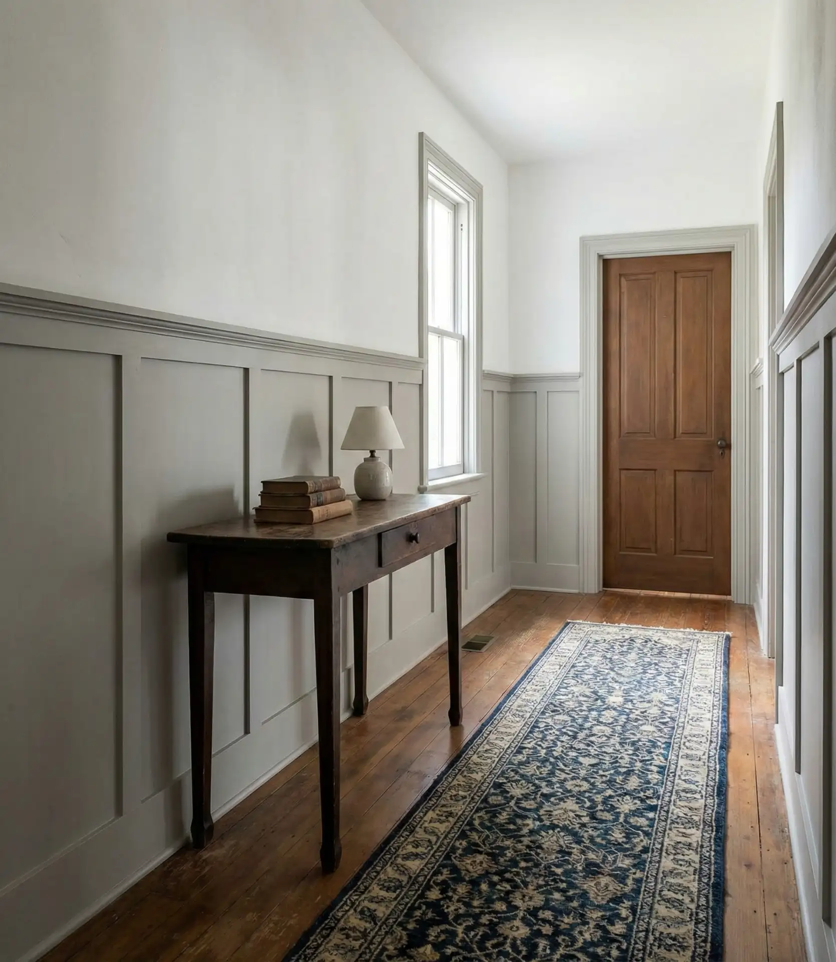
4. Neutral Board-and-Batten for Architectural Interest
The paint color does not need to work alone when the hallway has wall molding.
Board-and-batten painted in warm beige, greige, soft white, or muted taupe adds depth while remaining practical for a busy corridor.
You can paint the entire treatment one color or use a deeper shade below and lighter paint above.
Best for: farmhouse, Craftsman, Colonial, and transitional homes.
For more wall-treatment inspiration, see these farmhouse accent wall layout ideas.
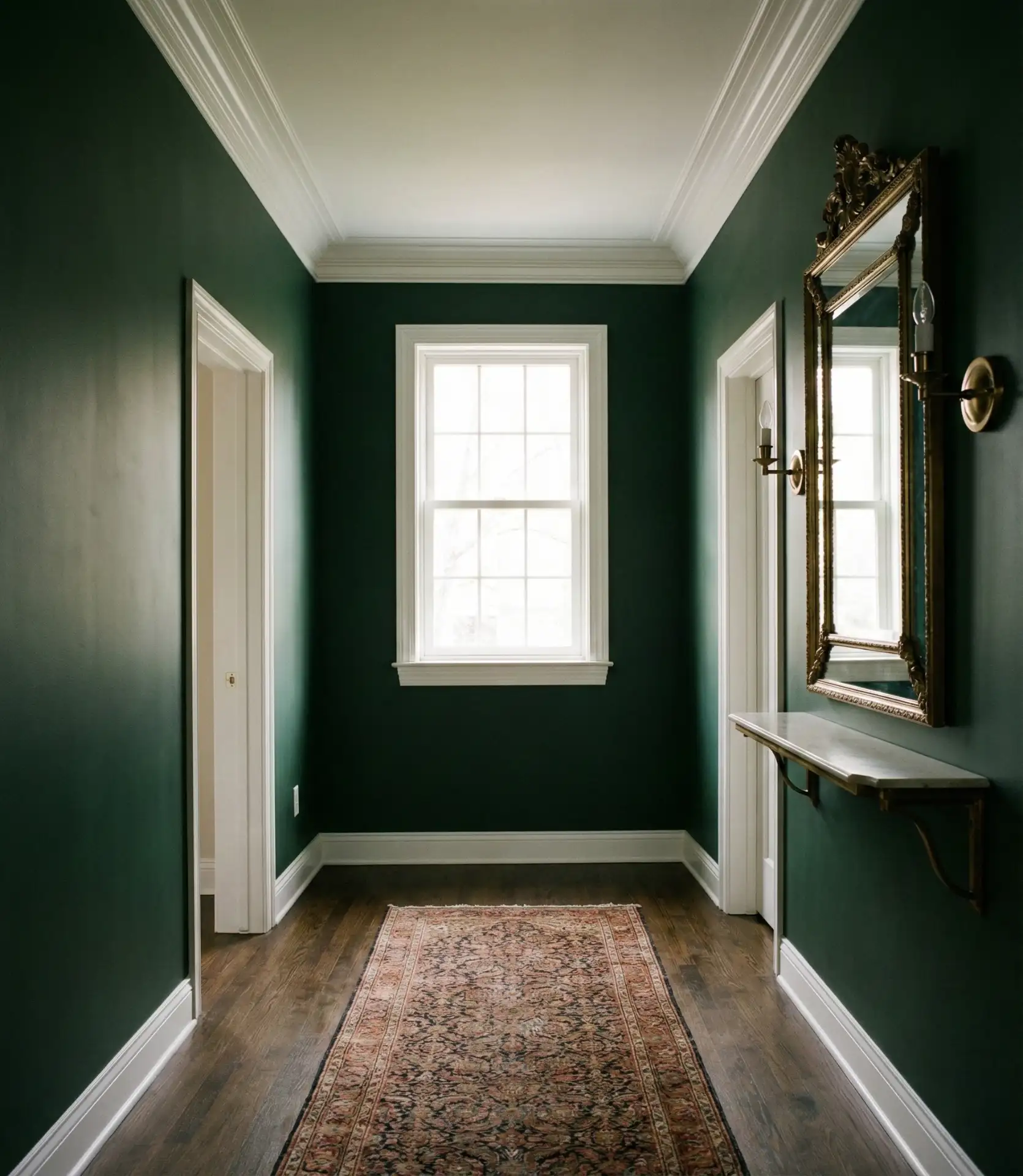
5. Moody Forest Green for Cozy Depth
Forest green works beautifully when you want to embrace a narrow hallway rather than trying to make it look larger.
The deep color pairs naturally with walnut, oak, brass, antique-style lighting, and traditional artwork.
A darker green can also make a collection of framed prints or photographs look more deliberate.
Best for: moody, vintage, traditional, and modern-rustic interiors.
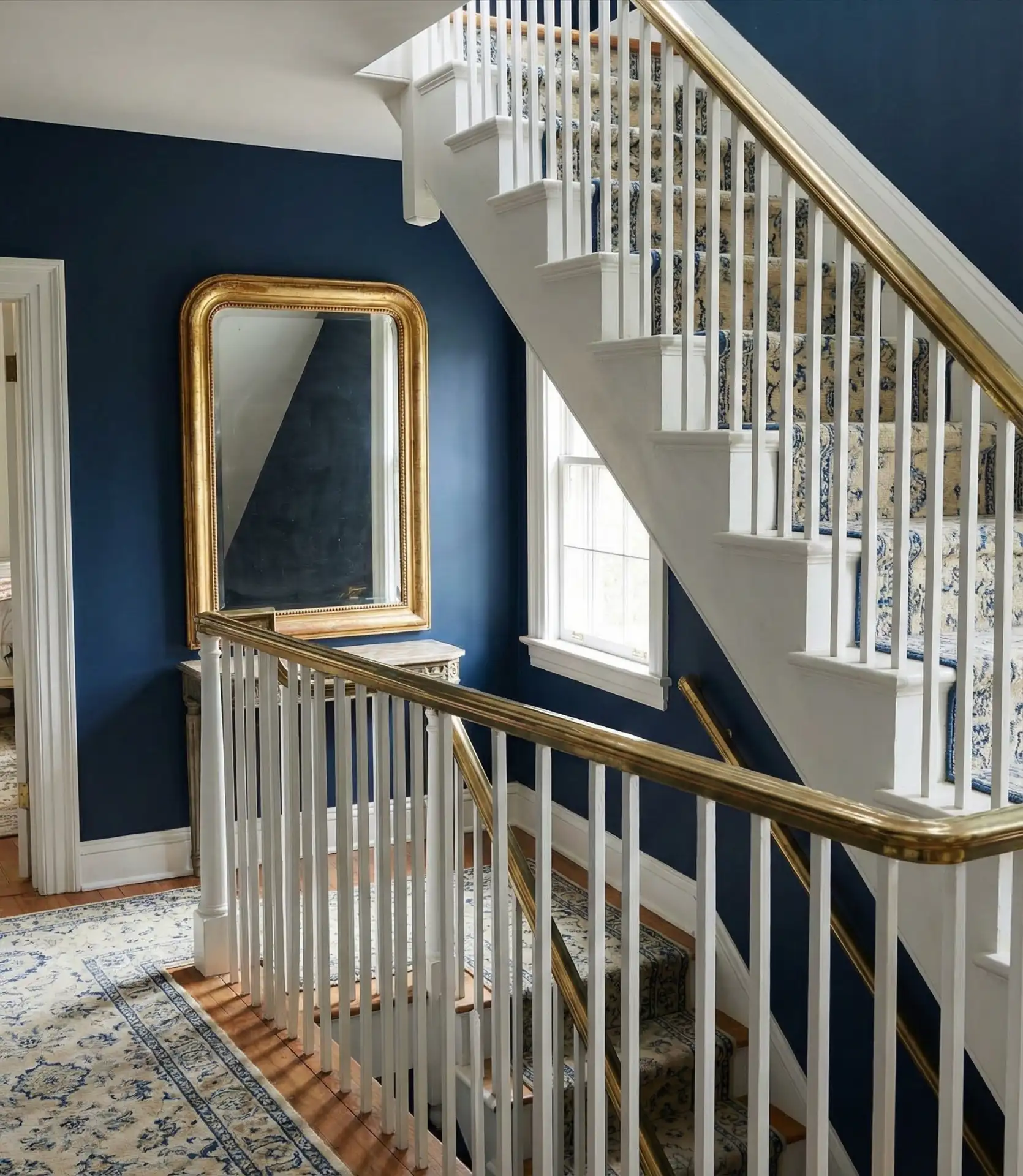
6. Navy Blue for Timeless Sophistication
Navy gives a hallway color without feeling overly trendy.
It works particularly well on staircase walls where the color can continue vertically and emphasize the height of the space.
Pair navy with white trim for crisp contrast, or use brass and natural wood for something warmer.
Designer-style option: continue the color onto the ceiling or use a slightly lighter related blue overhead for a more cocooning effect.
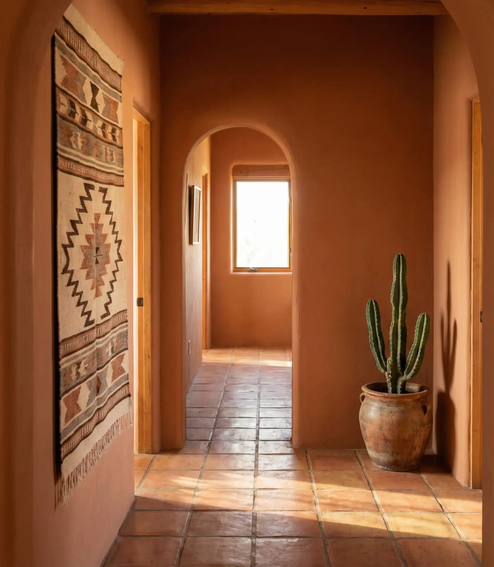
7. Warm Terracotta for an Earthy Glow
Terracotta gives a cold corridor immediate warmth.
Clay, rust, and muted burnt-orange tones work especially well with arched doorways, textured walls, wood flooring, and Mediterranean or Southwestern influences.
Add olive greenery, jute, linen, and warm-toned wood to make the hallway feel grounded rather than bright orange.
Important: terracotta undertones can shift noticeably in artificial light, so test a large sample before painting the entire corridor.
8. Two-Tone Hallway Walls for Practical Contrast
A two-tone scheme adds architectural interest even when the hallway does not have existing molding.
Use the darker color on the lower portion of the wall and a lighter tone above.
Navy with warm white, charcoal with greige, olive with cream, or taupe with ivory can all work well.
The darker lower section also helps disguise marks in a high-traffic area.
Placement tip: align the color break with existing architectural features where possible rather than choosing an arbitrary height.
9. Soft Blush Pink for Gentle Warmth
Blush is an easy way to warm up a hallway without using beige.
Choose dusty, muted pink rather than a bright candy shade for a more grown-up effect.
It works particularly well with pale oak, brass, soft gray flooring, cream trim, and black accents.
Best for: upstairs hallways, bedrooms corridors, vintage homes, and soft contemporary interiors.
10. Soft Butter Yellow for a Windowless Hallway
A muted butter or cream-yellow can introduce the feeling of warmth where there is little natural light.
Avoid highly saturated lemon tones in a narrow corridor because strong color often looks more intense once it is surrounded by close walls.
Pair soft yellow with warm white trim, medium wood, blue accents, or muted green in nearby rooms.
Best for: north-facing and windowless hallways that need warmth rather than stark brightness.
11. Black for a Bold Statement Hallway
Black paint can make a small transitional space feel deliberately dramatic rather than forgotten.
Use it behind artwork, pale trim, mirrors, or metallic lighting for strong contrast.
The look works best when the hallway has enough artificial or natural light to reveal detail rather than disappearing into darkness.
Best for: contemporary, eclectic, industrial, and historic homes with bold architectural character.
12. Warm Cream for an Easy Timeless Neutral
Cream has the brightness of white without feeling quite as stark.
It is particularly useful when the hallway connects rooms with warm wood floors, traditional furniture, or beige and brown finishes.
Use cream as a quiet background for family photographs, runners, mirrors, and heirloom furniture.
Best for: traditional homes and anyone who wants flexibility without plain white.
13. Soft Cool Gray for Minimalist Hallways
Gray can still work in 2027 when it feels intentional rather than like the cool builder-gray palette of previous years.
Choose a balanced gray with only a subtle cool undertone and pair it with black, stainless steel, clear glass, or colorful artwork.
It can be especially useful when adjacent rooms already contain stronger colors because the hallway becomes a quiet transition zone.
Avoid: very blue or purple grays unless those undertones clearly complement the rest of the home.
14. Use a Jewel Tone on the Staircase Wall
You do not need to paint the entire hallway a bold color to create drama.
Paint the staircase wall emerald, burgundy, charcoal, or deep blue while leaving connecting hallways in a quieter neutral.
This draws the eye upward and makes the stairwell feel like an architectural feature.
Best for: split-level homes, two-story entries, and staircases visible from the living area.
15. Olive Green for Natural Sophistication
Olive is one of the easiest deep greens to integrate because it behaves almost like a warm neutral.
It works with pale oak, dark walnut, leather, natural stone, brass, black, and woven finishes.
That versatility makes it useful in hallways where several flooring types or adjoining room palettes meet.
2027 pairing: olive + warm oak + aged brass + cream.
16. Coastal Blue-Gray for a Calm Transition
Blue-gray can make a hallway feel cooler and calmer without turning it into an obvious coastal theme.
Pair it with white trim, natural linen, weathered wood, or pale oak.
This tone works especially well in bright hallways where strong warm colors may appear overly yellow in direct daylight.
Best for: coastal, farmhouse, cottage, and relaxed transitional homes.
17. Coordinate the Hallway With the Kitchen
Sometimes the best hallway color is not the most exciting standalone shade—it is the color that connects the surrounding rooms.
If the hallway opens directly into a white or cream kitchen, continue a related warm neutral rather than introducing a completely unrelated accent color.
You can vary the wall color slightly while repeating the same trim color throughout both spaces.
Best for: ranch homes, bungalows, and semi-open layouts where the hallway is visible from the kitchen or dining room.
18. Dusty Rose for Vintage Elegance
Dusty rose gives a hallway more personality than beige while remaining muted enough for an everyday space.
The mauve undertones pair beautifully with brass, copper, velvet, dark wood, and vintage artwork.
Because the color already has noticeable character, you can keep the rest of the hallway relatively simple.
Easy styling formula: dusty rose walls + brass light + wood console + one runner.
19. Warm Taupe for Maximum Flexibility
Taupe sits comfortably between beige, brown, and gray, making it one of the most adaptable hallway colors.
Depending on the lighting, the same shade can look warmer in one section of the corridor and slightly grayer in another.
Pair it with cream trim, black frames, oak, walnut, stone, or aged brass.
Important: taupe is especially sensitive to surrounding light and flooring, so test the color beside your actual trim and floor rather than judging it from a small chip.
20. Rich Burgundy for Historic Warmth
Burgundy can make a small hallway feel surprisingly luxurious.
The deep red tone works beautifully with historic woodwork, antique brass, gold, traditional rugs, and pale wood accents.
It is bold enough to give a simple corridor identity but classic enough to suit older architecture.
Best for: Victorian, Tudor, traditional, and eclectic homes.
Amazon Find: Battery Picture Lights
Wireless picture lights can help artwork stand out against deep hallway colors such as charcoal, forest green, navy, or burgundy without requiring a large lighting renovation.

Best Hallway Paint Colors by Lighting
| Lighting | Good Choices | Use Carefully |
|---|---|---|
| Very little natural light | Cream, warm white, butter yellow | Cold blue-gray |
| Bright daylight | Greige, olive, blue-gray, taupe | Very bright yellow |
| Warm artificial light | Forest green, navy, terracotta, burgundy | Strong orange undertones |
| Mixed light | Greige, taupe, cream | Undertone-heavy gray |
Best Paint Colors for Narrow Hallways
A narrow hallway does not automatically need pale paint. You have two strong directions:
- Make it feel lighter: use cream, warm white, greige, or soft yellow.
- Embrace the intimacy: use charcoal, forest green, navy, burgundy, or black.
- Add width visually: use a two-tone horizontal treatment.
- Reduce visual clutter: keep doors and trim close to the wall color.
- Add rhythm: use repeated artwork or photographs instead of many unrelated accessories.
For long corridors, these photo wall ideas include dedicated hallway photo strips, narrow vertical stacks, and long staircase displays.
Hallway Paint Color Checklist
- Check the natural light: note whether the hallway has windows or borrows light from adjoining rooms.
- Look at the flooring: wood, stone, carpet, and tile can change how wall undertones appear.
- Check adjoining rooms: the hallway should connect the palettes rather than fight them.
- Sample large areas: small paint chips rarely show the full effect.
- Check morning and evening: hallway colors can shift dramatically under artificial light.
- Choose a washable finish: corridors are high-touch, high-traffic spaces.
- Decide on trim contrast: white trim creates separation while color-matched trim feels more modern.
- Consider the ceiling: it can stay light or become part of a color-drenched scheme.
- Plan artwork before painting: deeper wall colors can dramatically change how frames look.
- Test before buying gallons: undertones are especially noticeable in enclosed spaces.
Common Hallway Paint Mistakes
- Choosing paint from a tiny chip: hallway walls surround you closely, making colors feel more intense.
- Ignoring artificial lighting: a color that looks beautiful in daylight may look completely different at night.
- Using stark cool white everywhere: it can make a dim hallway feel institutional rather than bright.
- Assuming dark colors make every small hallway smaller: a deep shade can create deliberate depth when paired with good lighting.
- Ignoring flooring undertones: warm oak, gray tile, and beige carpet all influence wall color.
- Using a delicate finish in a busy corridor: choose a washable paint appropriate for high-traffic walls.
- Changing color at every doorway: too many unrelated transitions can make the hallway feel fragmented.
- Forgetting trim and doors: they are a large part of the finished color scheme.
- Picking saturated yellow or pink too quickly: enclosed corridors can make bright colors much stronger than expected.
Frequently Asked Questions
What hallway colors are likely to feel fresh in 2027?
Warm neutrals, olive and forest greens, terracotta, muted pinks, taupe, burgundy, navy, and deep charcoal all offer a more layered alternative to plain cool gray while still being easy to integrate into a home.
What color makes a hallway look bigger?
Warm white, cream, pale greige, and other light neutrals can visually reduce contrast and make a hallway feel more open. Good lighting, mirrors, and consistent trim also help.
Are dark hallway colors a bad idea?
No. Charcoal, navy, green, black, and burgundy can create a sophisticated cocooning effect, particularly when paired with warm lighting, reflective frames, or lighter flooring.
What is the best paint color for a hallway with no windows?
Warm white, cream, soft yellow, or a balanced warm greige are easy choices. Another option is to deliberately go dark with navy or charcoal and rely on layered artificial lighting.
Should the hallway be the same color as the living room?
It does not have to match exactly, but the colors should relate. Repeating the trim color, undertone, or one shared neutral can make transitions feel smoother.
What paint finish is best for hallway walls?
A durable washable eggshell or satin-type wall finish is practical for many hallways because these spaces tend to collect fingerprints and scuffs. Always follow the paint manufacturer’s recommendations for the specific product.
Should hallway doors and trim stay white?
White trim creates crisp contrast, but it is not the only option. Painting doors and trim close to the wall color can create a calmer, more seamless look, especially with deeper shades.
Recommended Finds for a Hallway Paint Refresh
The right preparation tools can make more difference than buying lots of hallway decor after painting.
- Paint sample boards — for testing color in different parts of the hallway.
- Painter’s tape — for trim, two-tone walls, and cleaner edges.
- Wall paint roller kit — for repainting long corridor walls more efficiently.
- Battery picture lights — for highlighting artwork against dark hallway paint.
- Hallway runner rug — for bringing texture and pattern into a freshly painted corridor.
- Gallery wall frame set — for creating a repeated visual rhythm on long walls.
- Warm wall sconces — for adding layered light to dark or windowless hallways where suitable.
Final Thoughts
The best hallway paint colors for 2027 do not all try to make the space brighter or larger. Some of the most interesting hallways work because they embrace their narrow proportions and use color deliberately.
Choose greige, cream, warm white, or taupe if you want a flexible backdrop. Use olive, forest green, navy, charcoal, burgundy, or black if you want the hallway to become a dramatic design moment.
Terracotta, dusty rose, blush, soft yellow, and blue-gray provide a middle ground when you want noticeable color without going extremely dark.
Most importantly, test the shade in the actual hallway before painting. Corridors have unusual lighting and many connecting surfaces, so the color that looks perfect on a sample card can change significantly once it surrounds the whole space.

Ankit is an engineer by profession and blogger by passion. He is passionate to do all the stuff such as designing the website, doing the SEO, researching for the content, writing tech blog posts and more.