
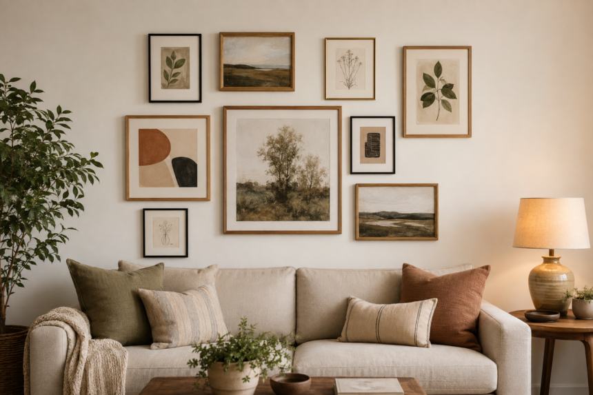
A gallery wall usually looks “tacky” because the layout lacks a repeatable rule—not because the art is inexpensive. Fixing spacing, scale, and visual connection can make thrifted frames and printable art look thoughtful.
Related AndroidNature ideas:
The Three Problems to Fix First
1. The Spacing Changes From Frame to Frame
Uneven gaps make the eye stop at every mistake, even when the artwork is beautiful. Random tight and wide spaces can make the wall look accidental rather than collected.
Fix it: Choose one gap—often around 2 to 3 inches for a compact arrangement—and use a spacer or paper template to repeat it.
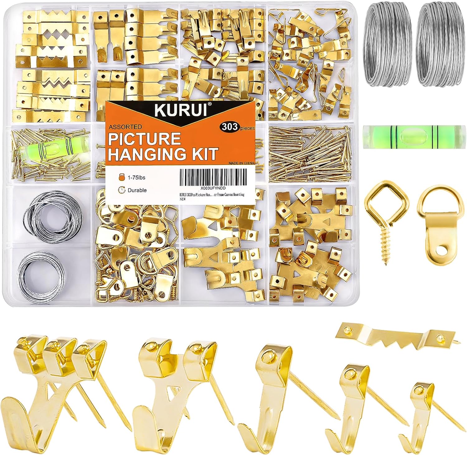
Amazon Find: Picture Hanging and Leveling Kit
A basic hanging kit and level help repeat spacing and keep frame rows steady.
2. There Is No Clear Anchor or Outer Shape
When every frame is small and equal, or the arrangement has no strong center, the wall can feel scattered. A gallery needs one visual anchor and a shape that relates to the furniture below.
Fix it: Begin with the largest piece, then build a rectangle, grid, stair-step, or balanced organic outline around it.
3. Too Many Styles Compete at Once
Mixing unrelated frame colors, art palettes, quote signs, family photos, and novelty objects can turn personality into visual noise. Variety works only when something repeats.
Fix it: Limit the mix with one shared color palette, two frame finishes, or a repeated subject such as landscapes or black-and-white photography.
Gallery Wall Layout Ideas That Look More Polished
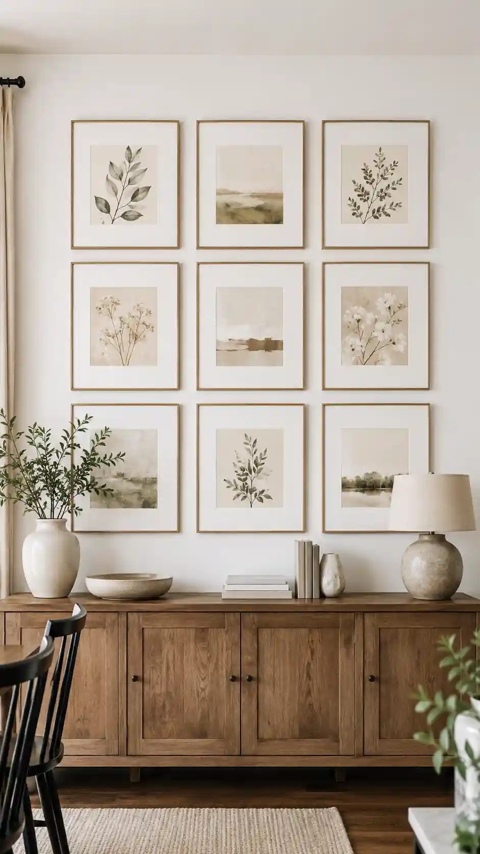
1. Clean Grid
Use matching frames in straight rows for a calm modern look.
Best for: Dining rooms, offices, and modern living rooms.
2. Centered Anchor
Place the largest art in the center and balance smaller pieces around it.
Best for: A large wall above a sofa or console.
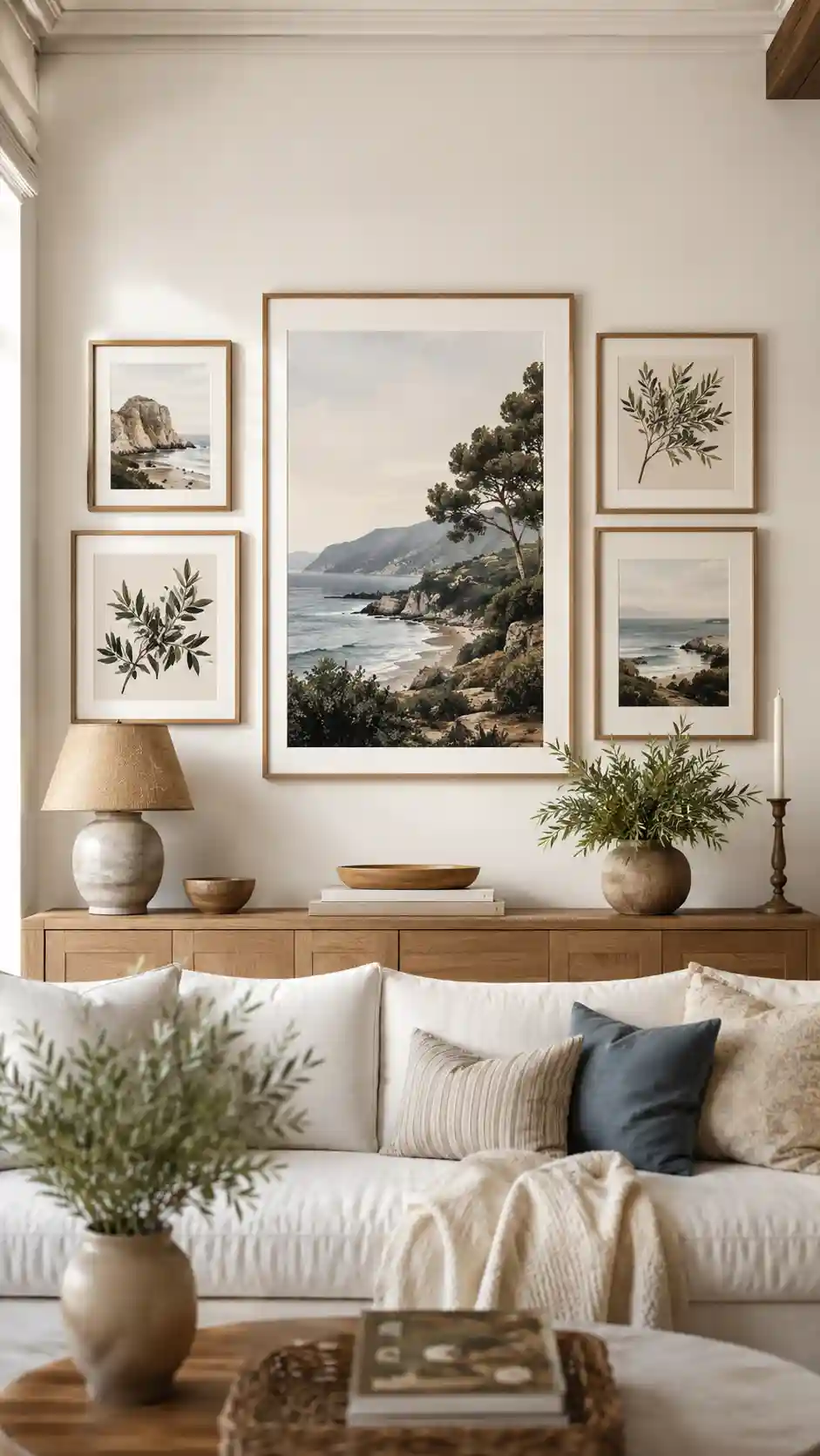
3. Off-Center Anchor
Start with a large piece on one side and balance its weight across the wall.
Best for: Eclectic rooms that still need visual balance.
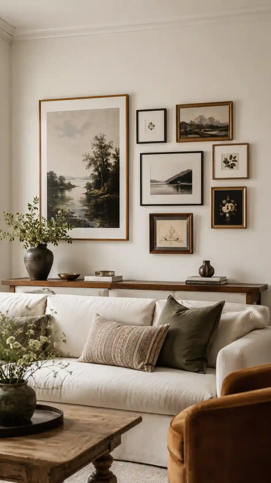
4. Bottom-Aligned Row
Line up the lower frame edges above a sofa, console, or bed.
Best for: Low furniture and wide wall spaces.
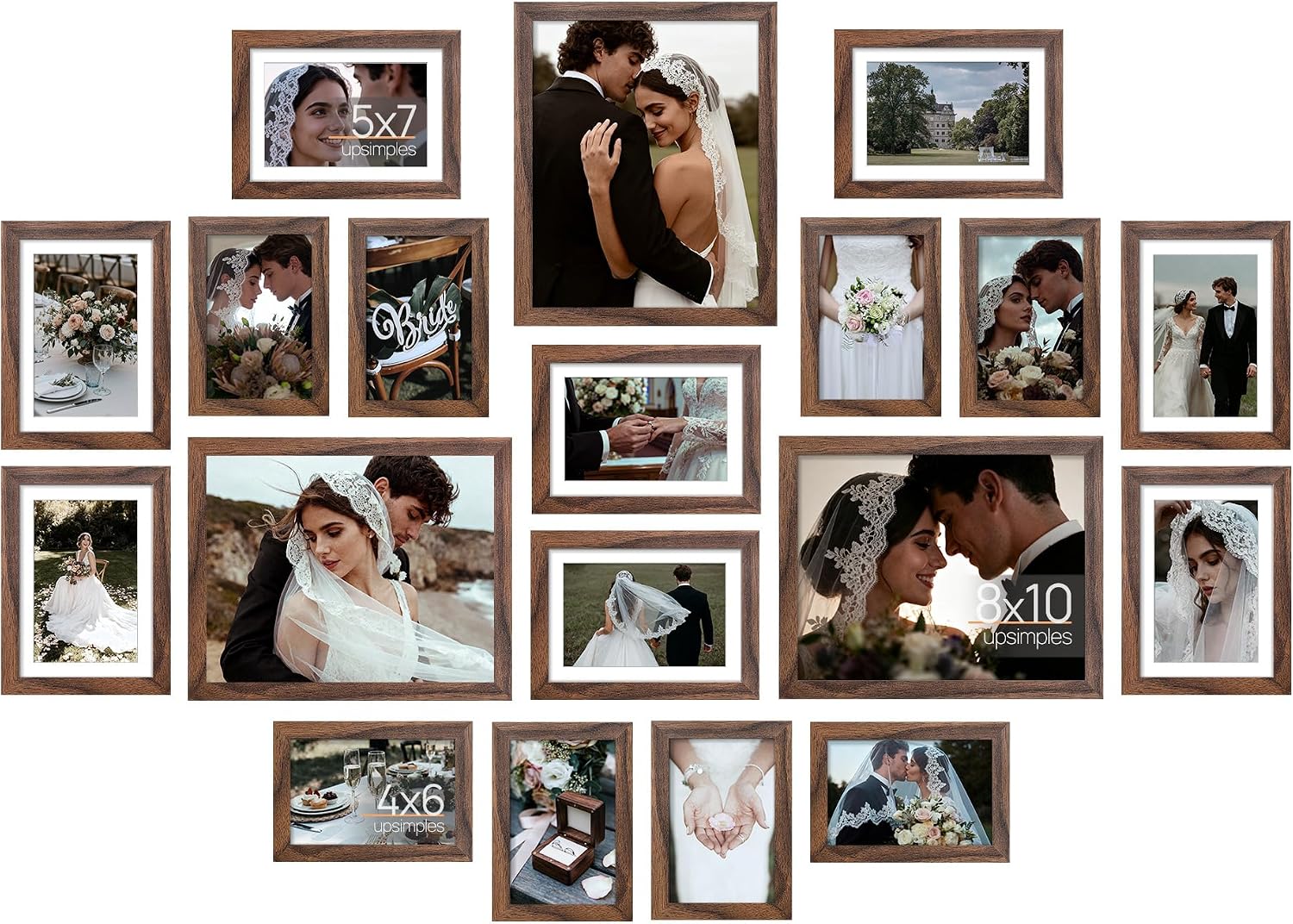
Amazon Find: Gallery Wall Frame Set
A coordinated frame set gives mixed artwork one repeating finish and makes planning faster.
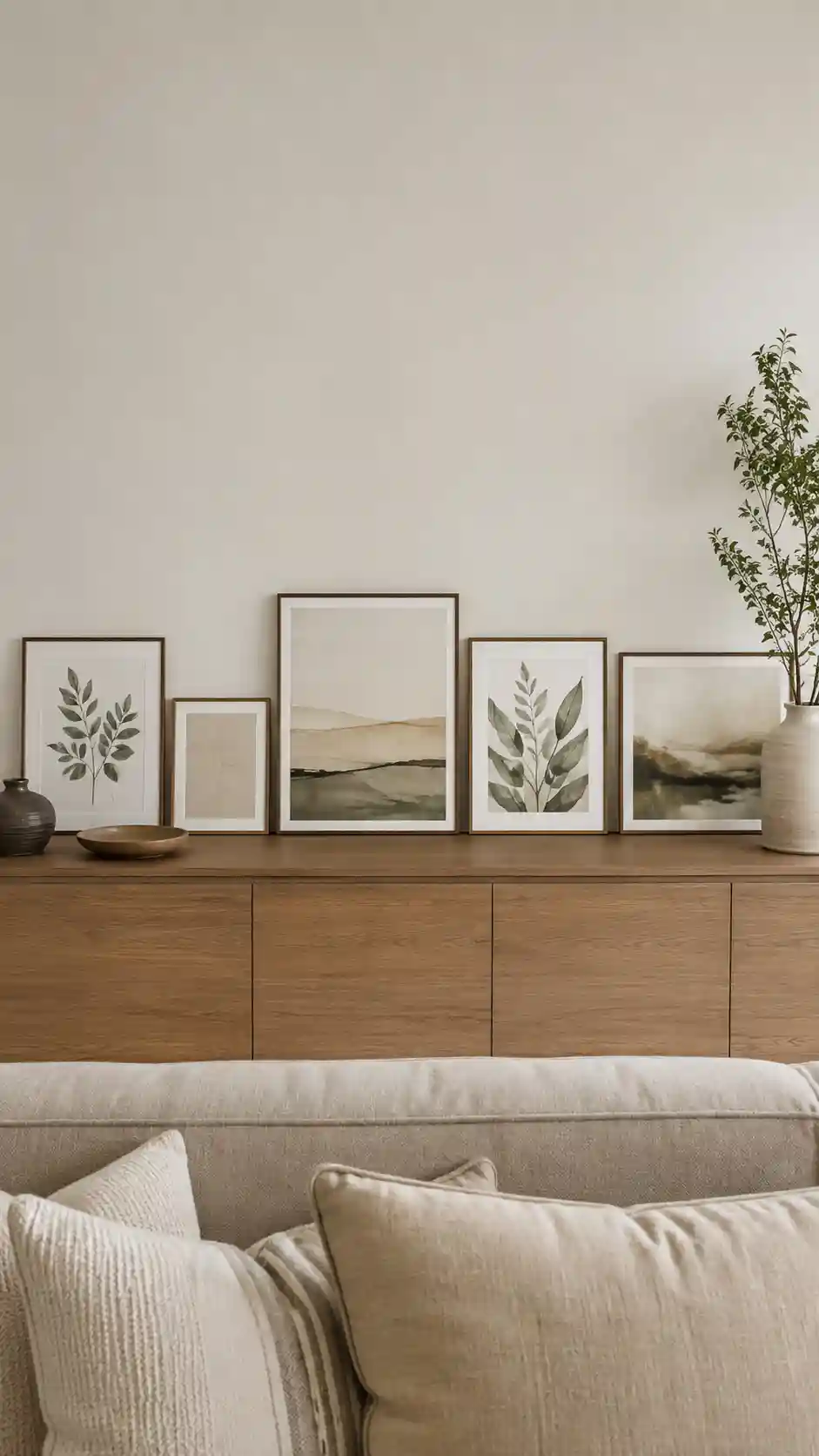
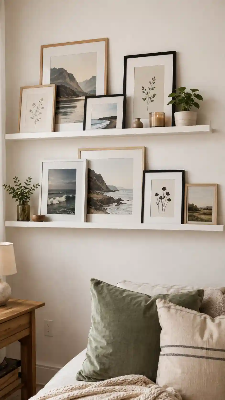
5. Picture-Ledge Layers
Lean overlapping frames on one or two ledges so the display can change easily.
Best for: Renters and people who enjoy rotating art.
6. Stair-Step Layout
Follow the rise of a staircase with an even diagonal rhythm.
Best for: Hallways and staircase walls.

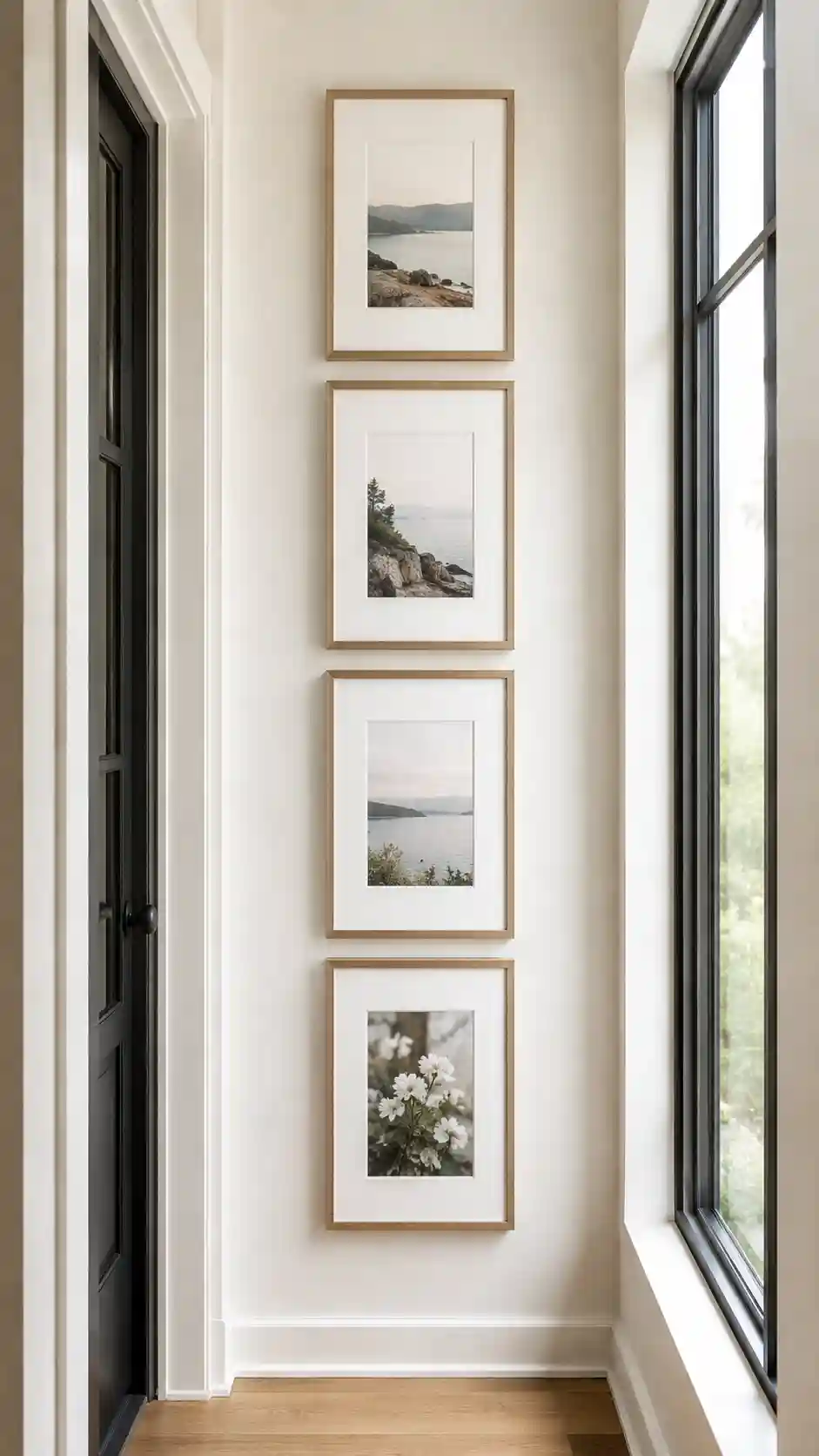
7. Vertical Column
Stack a narrow arrangement in a hallway, corner, or between windows.
Best for: Small walls and narrow architectural gaps.
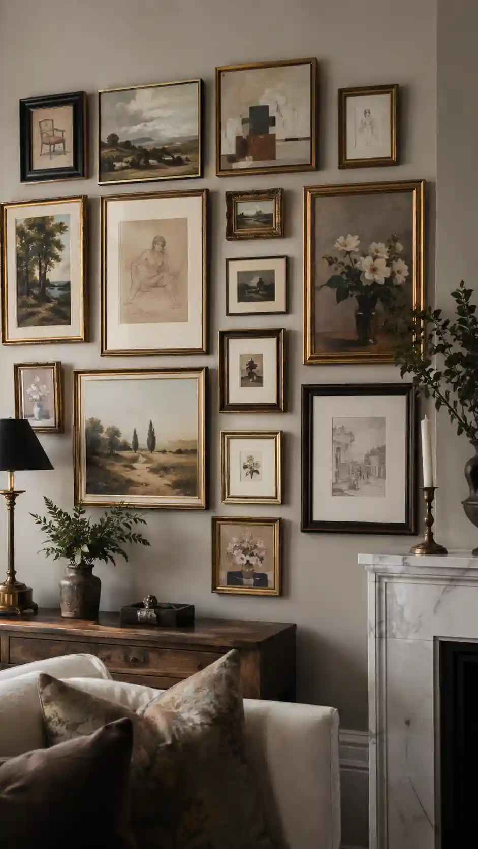
8. Salon-Style Collection
Use mixed sizes in a dense arrangement unified by color or frame finish.
Best for: Collected vintage art and mixed media.
Amazon Find: Removable Paper Wall Templates
Paper templates let you test the outer shape and spacing before making holes.
The Easy Floor-Layout Method
- Measure the wall area and mark that size on the floor with painter’s tape.
- Place the largest frame first.
- Add the next largest pieces on opposite sides.
- Repeat the same gap with a spacer.
- Photograph the finished floor layout.
- Trace frames on paper and tape the templates to the wall.
- Check the full arrangement from across the room before hanging.
| Furniture Below | Gallery Width | Layout Direction |
|---|---|---|
| Sofa | Roughly relate the group to the sofa width | Wide horizontal or organic rectangle |
| Console | Center on the console | Grid, anchor, or bottom-aligned |
| Bed | Keep secure and visually calm | Lightweight grid or ledge away from sleep area |
| Stairs | Follow the stair rise | Even diagonal stair-step |
Gallery Wall Mistakes to Avoid
- Hanging the full group too high above the furniture.
- Using tiny frames across a very large wall without an anchor.
- Changing spacing to force one last piece into a gap.
- Mixing every frame finish and art style without a repeated element.
- Skipping templates and making many unnecessary holes.
- Using hanging hardware that is not suitable for the wall or frame weight.
FAQs
How much space should be between gallery wall frames?
A repeated gap matters more than one exact number. Many compact walls look connected with roughly 2 to 3 inches, while larger pieces can handle slightly more.
Should all gallery wall frames match?
No. Mixed frames can work when you repeat one or two finishes, a color palette, or a consistent mat style.
What frame should I hang first?
Start with the largest or most important piece because it sets the scale and visual center.
How do I plan without damaging the wall?
Test the arrangement on the floor, trace each frame on paper, and tape the templates to the wall before installing hardware.
Can a gallery wall work in a small room?
Yes. Use a narrow column, small grid, or compact arrangement with consistent spacing rather than spreading pieces across the full wall.
Final Thoughts
Before buying new art, edit the pieces you already have and fix the spacing and outer shape. One clear anchor and one repeated visual rule can turn a scattered wall into a collected display.
Nothing much to say, too much to write! Love to write about Tech & Games.