

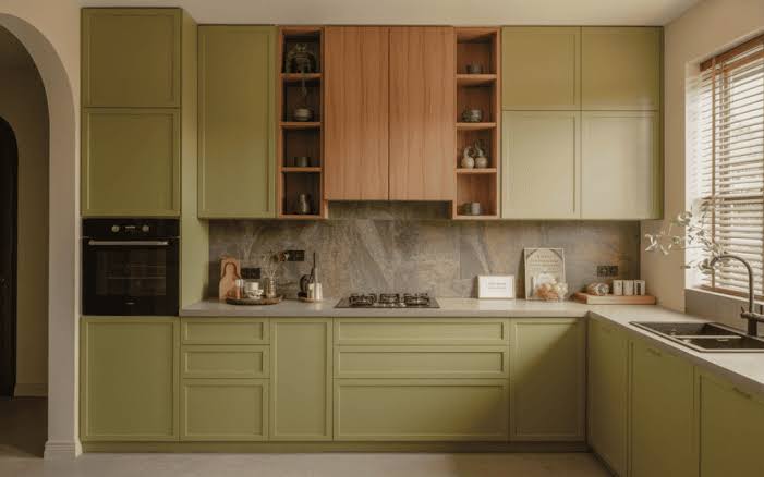
Choosing a new kitchen cabinet color can completely transform how your home looks and feels. Your cabinets occupy a large portion of the kitchen, so changing their color can make a small room feel brighter, give a dated kitchen a sophisticated update, or add personality to a space that feels a little too plain.
Kitchen cabinet color trends in 2026 are moving toward warm neutrals, natural greens, grounded blues, beautiful wood finishes, and carefully chosen dark accents. Instead of relying only on bright white or cool gray, homeowners are embracing colors that feel comfortable, timeless, and connected to natural materials.
Whether you love soft sage cabinets, creamy greige, deep blue-green, or a beautiful combination of natural oak and painted cabinetry, these 13 trending kitchen cabinet colors offer ideas for different kitchen sizes and decorating styles. You’ll also discover backsplash pairings, hardware finishes, practical paint-selection advice, color combinations, and common mistakes to avoid before starting your makeover.
Affiliate disclosure: As an Amazon Associate, I earn from qualifying purchases. This article contains affiliate links, which may earn us a commission at no extra cost to you.
More Kitchen Makeover and Styling Inspiration
If you’re planning to refresh your kitchen cabinets, explore these related guides from AndroidNature.com for more renovation, storage, and decorating ideas.
- 12 Small Kitchen Remodel Ideas That Actually Maximize Space – Explore cabinetry layouts, light color palettes, and clever storage improvements.
- 10 Kitchen Counter Organization Ideas That Look Clean and Clutter-Free – Keep your refreshed kitchen organized and beautiful.
- How to Set Up a Countertop Coffee Bar – Discover ways to style an inviting coffee area that complements your cabinet colors.
- 11 Best IKEA Hacks for Japandi – Find more warm neutrals, natural wood finishes, and minimalist kitchen styling inspiration.
Quick List: 13 Trending Kitchen Cabinet Colors
- Benjamin Moore Oil Cloth – Muted Green-Gray
- Farrow & Ball Drop Cloth – Warm Greige
- Sherwin-Williams Accessible Beige – Soft Beige-Greige
- Farrow & Ball Cromarty – Pale Green-Gray
- Farrow & Ball French Gray – Earthy Green-Gray
- Sherwin-Williams Drift of Mist – Light Neutral Gray
- Benjamin Moore Narragansett Green – Deep Blue-Green
- Mushroom Taupe Cabinets – A Warm Modern Neutral
- Dusty Sage Green Cabinets – Nature-Inspired Calm
- Rich Navy Blue Cabinets – Timeless Sophistication
- Natural White Oak Cabinets – Light Organic Warmth
- Matte Charcoal Cabinets – Dark and Moody Elegance
- Two-Tone Cream and Walnut Cabinets – Beautiful Layered Contrast
What Kitchen Cabinet Colors Are Trending in 2026?
The overall direction for kitchen cabinet colors in 2026 is warm, grounded, and personal. Bright white kitchens are still popular, but warmer whites and greige tones are becoming attractive alternatives. Muted greens and rich blues offer color without feeling overly bright, while natural wood cabinets add organic texture.
Another important direction is mixing finishes. Instead of painting every cabinet one shade, you might combine creamy upper cabinets with an olive island, pair mushroom base cabinets with a natural oak pantry, or use a dark charcoal island against lighter perimeter storage.
The goal isn’t to follow every new trend. It’s to choose a color that complements your countertops, flooring, natural light, and the rest of your home. A well-chosen cabinet finish should look beautiful not just in a photograph but during everyday use.
How to Choose the Perfect Kitchen Cabinet Color
Start with the finishes you don’t plan to replace. Flooring, countertops, backsplash tile, and appliances all influence how a cabinet color appears. A warm beige cabinet may look beautiful against white quartz but clash with a countertop that has distinctly cool gray veining.
Next, consider natural light. North-facing kitchens may make some colors appear cooler, while strong afternoon sunlight can emphasize warmth. Dark cabinet colors can look dramatic in a bright kitchen, but the same shade may feel much heavier in a narrow room with limited windows.
Always test large color samples beside the existing surfaces, ideally on movable sample boards. Look at them in morning daylight, afternoon light, and under your kitchen bulbs at night. Check how the color looks both vertically on the cabinet and horizontally against nearby counters.
Easy Kitchen Cabinet Color Formula
Cabinet Color + Coordinating Countertop + Complementary Backsplash + Consistent Hardware + Balanced Lighting
For example, combine muted sage green lower cabinets with warm white uppers, creamy quartz countertops, a simple ivory backsplash, and brushed brass hardware. The result feels fresh without relying on multiple competing colors.
Kitchen Cabinet Color Comparison Guide
| Color Family | Best For | Beautiful Pairings |
|---|---|---|
| Green-Gray | Organic and transitional kitchens | Warm white, oak, brass |
| Warm Greige | Classic and modern kitchens | Cream stone, walnut, black |
| Light Neutral | Compact kitchens and bright spaces | White tile, pale wood, nickel |
| Deep Blue-Green | Statement islands and dramatic kitchens | Cream quartz, brass, white |
| Mushroom Taupe | Warm minimalist kitchens | Limestone-look surfaces, oak |
| Navy Blue | Sophisticated traditional or modern rooms | White countertops, brass, walnut |
| Natural White Oak | Japandi and Scandinavian kitchens | Warm white, stone, soft black |
| Matte Charcoal | Modern statement cabinetry | Light stone, oak, brushed metal |
13 Trending Kitchen Cabinet Colors That Will Transform Your Kitchen
1Benjamin Moore Oil Cloth – Muted Green-Gray Cabinets
Benjamin Moore Oil Cloth is a beautiful muted green-gray cabinet color that creates a sophisticated, nature-inspired kitchen. It has more visual depth than pale sage but feels softer than a dramatic forest green. The shade can work beautifully with traditional shaker cabinets, modern slab doors, and transitional kitchen designs that combine classic and contemporary features.
Pair Oil Cloth with creamy white countertops, warm white walls, and natural wood accessories to keep the room inviting. Brushed brass or polished nickel hardware can provide a refined finishing detail. If your kitchen has limited daylight, consider using this deeper shade on lower cabinets or a single island while leaving upper cabinets lighter. Always test the actual paint sample beside your countertops because its green and gray undertones can shift with lighting.
Designer tip: A muted green-gray looks especially appealing with lightly veined white quartz and a few walnut cutting boards.
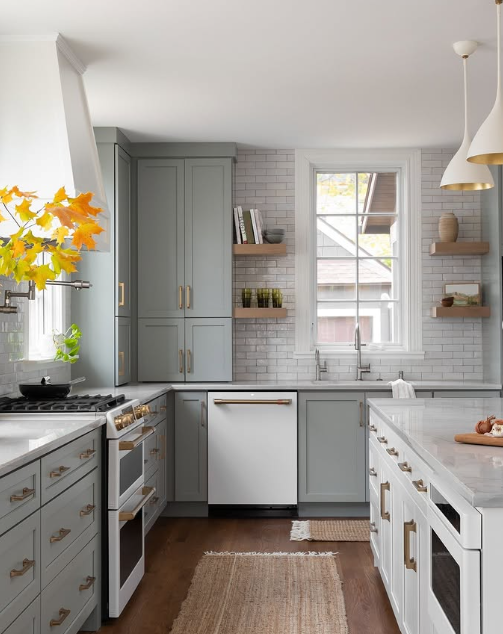
Image credit: @yourhomeinspo.com
2Farrow & Ball Drop Cloth – Warm Greige Cabinets
Farrow & Ball Drop Cloth offers a warm balance between beige and gray, making it a lovely choice for kitchens that need a softer alternative to plain white. The color has an understated architectural quality that can make cabinets look calm, expensive, and beautifully integrated with the surrounding room. It’s particularly attractive in traditional, European-inspired, and warm minimalist kitchens.
Try Drop Cloth on shaker-style cabinets alongside creamy stone countertops, simple ivory tile, and muted brass hardware. Warm oak flooring or a natural wood island can add beautiful contrast without overwhelming the neutral palette. For a more contemporary appearance, pair the cabinetry with clean-lined black fixtures and a restrained backsplash. Choose sample boards rather than relying on online photos, because greige colors can vary noticeably in different light.
Color pairing: Drop Cloth + warm white + walnut + antique brass creates a beautifully layered neutral kitchen.
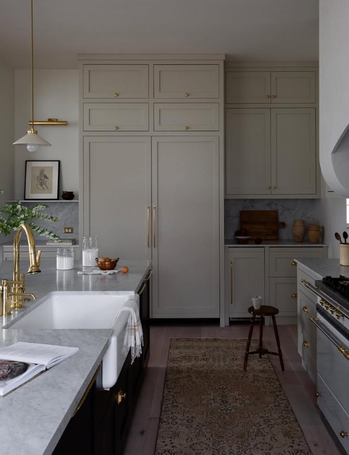
Image credit: @yourhomeinspo.com
3Sherwin-Williams Accessible Beige – Soft Beige-Greige Cabinets
Sherwin-Williams Accessible Beige is a versatile light neutral that blends the warmth of beige with a subtle gray influence. It can make a kitchen feel bright and welcoming without creating the stark appearance of brilliant white cabinetry. This is a lovely choice for homeowners who prefer timeless, easy-to-coordinate finishes and want cabinetry that works with both classic and modern furnishings.
Use Accessible Beige on upper and lower cabinets with crisp but not overly cool white walls, light countertops, and simple brass or nickel hardware. Add natural wood stools, linen window treatments, and subtle ceramic accessories for texture. In a smaller kitchen, keeping the backsplash and walls relatively light can help create a connected visual palette. Test the color against your flooring to make sure the beige undertones remain balanced.
Small-kitchen tip: Accessible Beige can provide gentle color without the dramatic contrast of dark cabinets, making it worth considering for compact spaces.
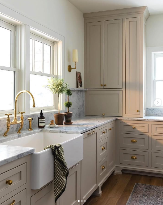
Image credit: @yourhomeinspo.com
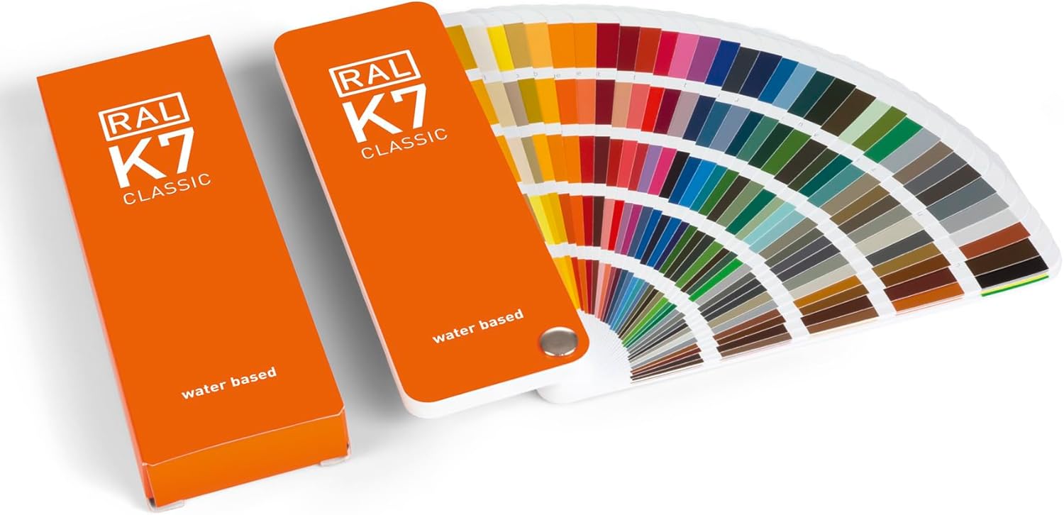
Amazon Find: Kitchen Cabinet Paint Sample Supplies
Compare paint sample boards, brushes, and testing supplies before committing to a cabinet color.
4Farrow & Ball Cromarty – Pale Green-Gray Cabinets
Farrow & Ball Cromarty is a soft green-gray cabinet color with a gentle, almost misty appearance. It’s an appealing choice when you want to add a little color without making the kitchen feel obviously green. The shade works particularly well in coastal-inspired, cottage, Scandinavian, and traditional kitchens where a calm atmosphere is important.
Consider using Cromarty on lower cabinets with warm white uppers and a creamy backsplash. Natural oak stools, woven baskets, and understated nickel hardware can create a fresh, relaxed appearance. For a more unified look, carry a related pale neutral onto the walls while using countertop texture to introduce contrast. Because pale green-gray colors can appear different beside warm wood or cool stone, test large samples before deciding.
Styling tip: Cromarty looks especially soft beside light oak, warm ivory, and natural linen textures.
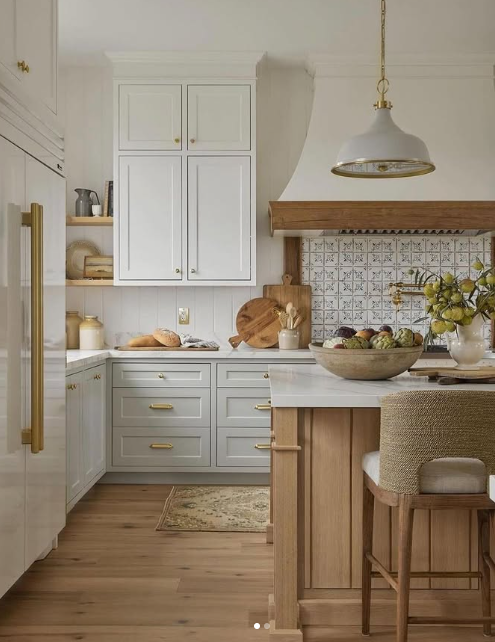
Image credit: @yourhomeinspo.com
5Farrow & Ball French Gray – Earthy Green-Gray Cabinets
Farrow & Ball French Gray brings more earthy depth than a very pale sage cabinet color. Its balanced green-gray character creates a collected, timeless appearance that works beautifully with natural materials. This shade is ideal for homeowners who want a kitchen with personality but prefer muted colors over dramatic jewel tones.
Try French Gray on a run of shaker cabinets and coordinate it with warm white countertops, aged brass hardware, and natural wood shelving. A simple cream backsplash allows the cabinetry to remain the main feature. If your room is bright, the color can be used more extensively; in darker kitchens, consider restricting it to lower cabinets or a feature island. Keep decorative accessories simple with cream ceramics, green plants, and wooden cutting boards.
Color tip: French Gray + cream stone + natural wood + antique brass creates a warm, organic kitchen palette.
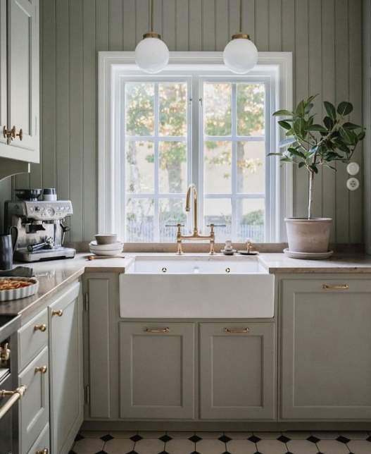
Image credit: @yourhomeinspo.com
6Sherwin-Williams Drift of Mist – Light Neutral Gray Cabinets
Sherwin-Williams Drift of Mist is a soft, airy neutral that provides subtle contrast against white walls and countertops. It offers a gentle alternative to bright white cabinets and can make the kitchen feel quiet and uncluttered. This color is particularly suitable for smaller kitchens, transitional interiors, and rooms where you want the cabinets to blend gracefully with surrounding finishes.
Pair Drift of Mist cabinets with a warm white backsplash, pale quartz countertops, and simple brushed nickel hardware. Introduce texture through oak shelves, woven window coverings, or a neutral kitchen runner. Avoid combining the paint with several unrelated cool gray materials, which may make the room feel flat. Instead, balance the pale neutral with a little natural wood and warm lighting.
Design tip: Test Drift of Mist beside your wall color before painting every cabinet. Two pale neutrals can look beautiful together, but their undertones need to work as a pair.
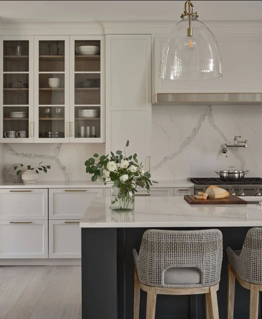
Image credit: @yourhomeinspo.com
7Benjamin Moore Narragansett Green – Deep Blue-Green Cabinets
Benjamin Moore Narragansett Green is a dramatic deep blue-green that can make a kitchen feel elegant and full of character. Depending on the lighting, the color may read as a rich teal, dark green, or blue-based shade. It’s a beautiful choice for a statement island, dramatic lower cabinets, or a full kitchen where the surrounding surfaces are bright enough to balance the depth.
Pair Narragansett Green with cream or white quartz countertops, a simple light backsplash, and warm metallic hardware. Natural walnut details create a rich contrast, while pale oak can soften the overall appearance. If your kitchen has limited daylight, start with the island or a standalone pantry cabinet before using this deep shade throughout the room. Use layered lighting to prevent dark corners from feeling visually heavy.
Designer tip: A dark blue-green island against light perimeter cabinets can introduce beautiful color without overwhelming the whole kitchen.
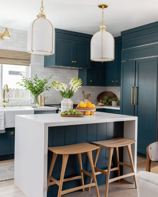
Image credit: @yourhomeinspo.com
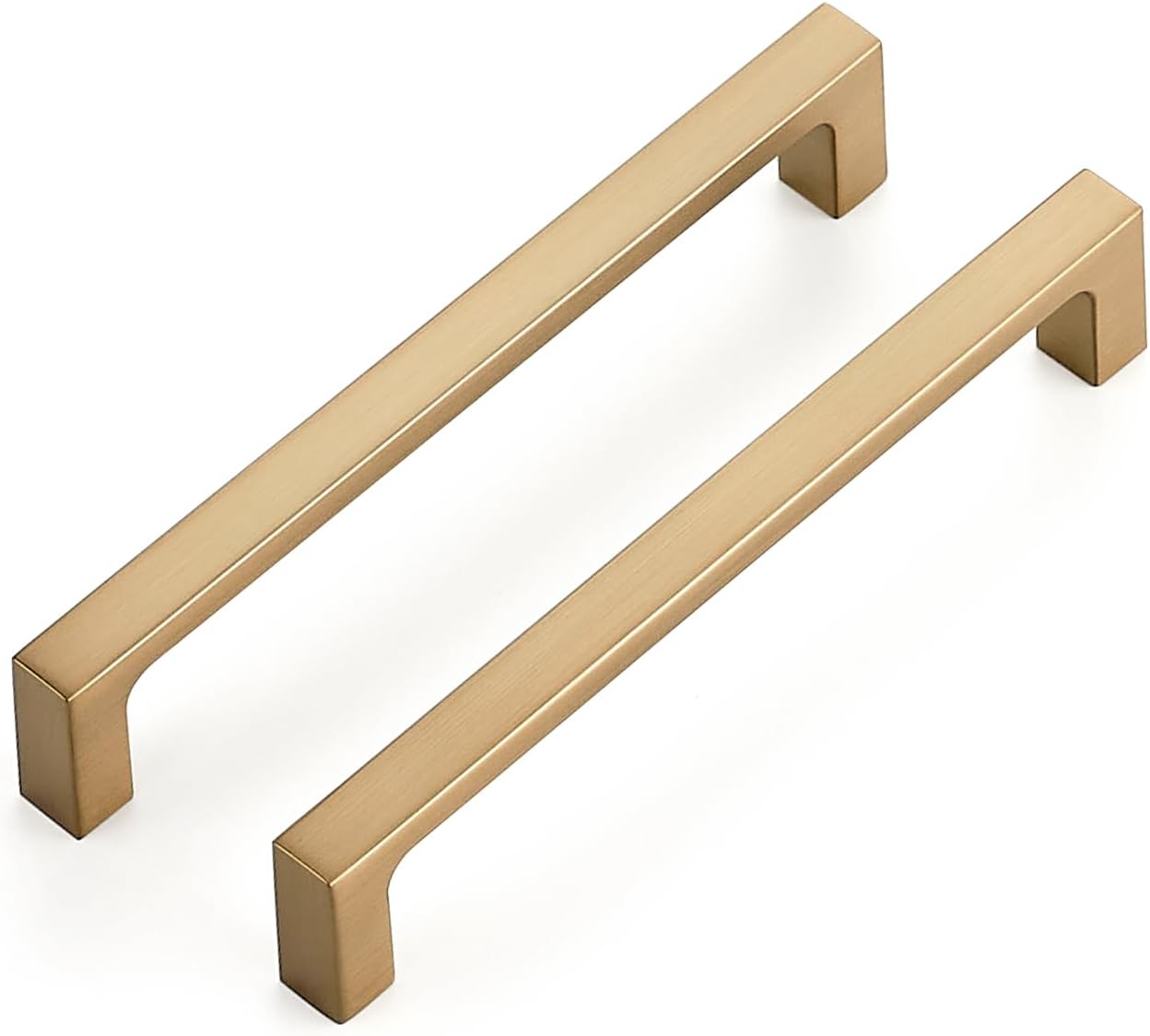
Amazon Find: Brushed Brass Cabinet Handles
Explore simple brass-look pulls that pair beautifully with muted greens, navy, and warm neutral cabinetry.
8Mushroom Taupe Cabinets – A Warm Modern Neutral
Mushroom taupe is one of the most appealing warm-neutral directions for contemporary kitchens. The color sits between beige, gray, and soft brown, giving cabinets a grounded appearance without making the room feel dark. It can look luxurious on simple shaker doors, flat-front cabinets, and traditional cabinetry with understated molding.
Choose a mushroom tone that coordinates with your flooring and countertops, then pair it with creamy white stone, warm brass or matte black hardware, and natural wood accents. A limestone-look backsplash can introduce subtle texture without a busy pattern. Keep surrounding wall colors light and connected to the cabinet undertone. This is especially effective in kitchens that open directly into neutral living or dining rooms.
Color tip: Mushroom taupe + warm white + pale oak creates a soft and sophisticated palette that works with many decorating styles.
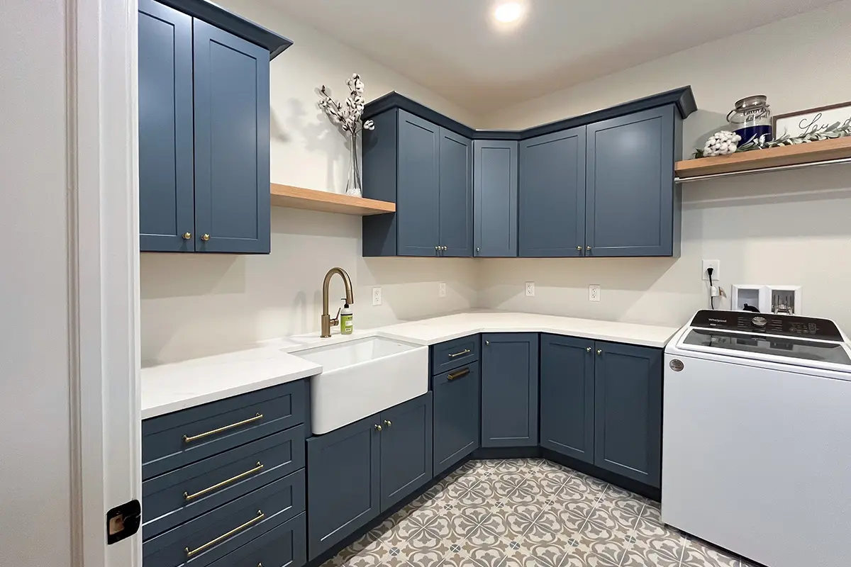
Image credit: @showplacecabinetry.com
9Dusty Sage Green Cabinets – Nature-Inspired Calm
Dusty sage green cabinets are a beautiful option when you want a kitchen that feels relaxing and connected to nature. Unlike bright greens, dusty sage has a muted quality that makes it easy to combine with wood, stone, and warm white surfaces. It can feel traditional in a farmhouse kitchen or modern when paired with clean-lined cabinet doors.
Use sage on lower cabinets, a central island, or the entire kitchen depending on the available daylight and your preferred look. Pair it with ivory subway tile, soft white quartz, light oak stools, and simple brass or nickel handles. For a more organic finish, add a few herb planters and neutral ceramics. Avoid using several competing greens around the room; choose one main shade and repeat it subtly.
Styling tip: Sage cabinets look especially beautiful beside natural white oak and creamy stone, creating a soft kitchen palette that feels fresh throughout the seasons.
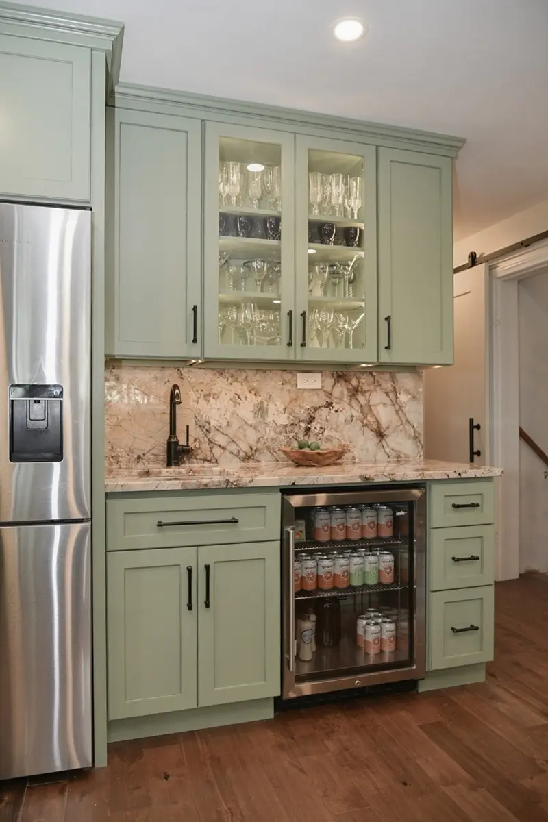
Image credit: @showplacecabinetry.com
10Rich Navy Blue Cabinets – Timeless Sophistication
Navy blue cabinets provide a rich, classic appearance that can work equally well in traditional and modern kitchens. The deep color brings visual depth and creates a beautiful contrast against white countertops, warm wood flooring, and polished metal finishes. Navy is particularly appealing when you want a dramatic cabinet color that doesn’t feel as stark as pure black.
Consider navy base cabinets with warm white upper cabinets for a two-tone look, or use it on a kitchen island surrounded by lighter perimeter storage. Pair the blue with creamy quartz countertops, brass handles, and a simple backsplash. A satin or matte cabinet finish can keep the color feeling sophisticated without excessive shine. Test dark paint samples at night to make sure the room has enough useful light for everyday cooking.
Color pairing: Navy + cream + walnut + brushed brass creates an elegant kitchen that balances warm and cool elements.
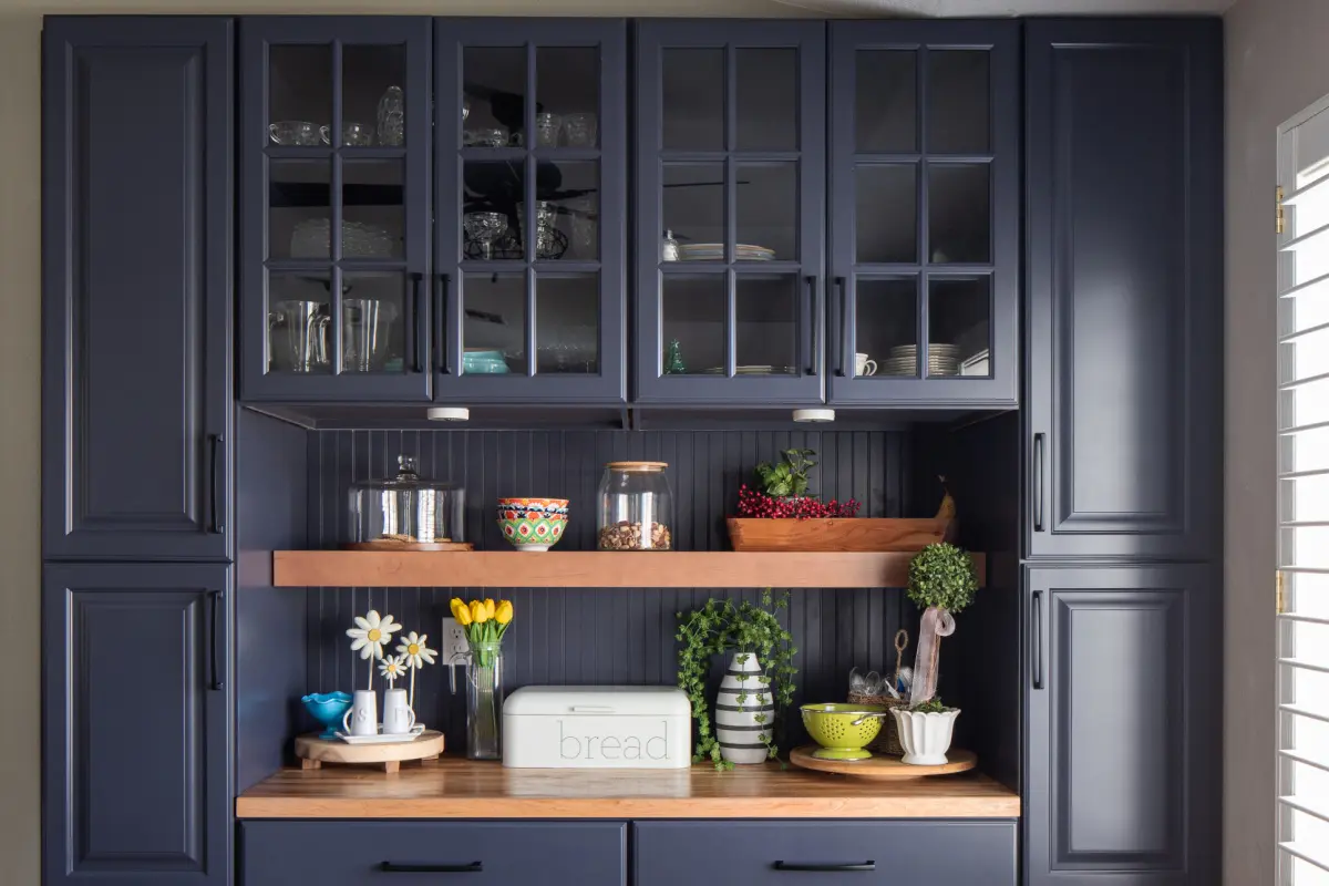
Image credit: @showplacecabinetry.com
11Natural White Oak Cabinets – Light Organic Warmth
Natural white oak cabinets bring warm texture and visible wood grain into the kitchen. Rather than relying on a painted color, this finish celebrates the character of the material itself. Light oak is especially beautiful in Japandi, Scandinavian, organic modern, and minimalist kitchens where natural materials and simple shapes play an important role.
Choose white oak cabinetry or compatible wood-front finishes with a restrained natural stain or clear protective coating. Pair the cabinets with warm white countertops, subtle stone-look tile, and understated hardware in brushed nickel, soft black, or brass. Keep the wood grain direction and finish consistent across large cabinet areas. If you’re mixing light oak with painted cabinets, use a warm neutral such as ivory, cream, or greige to preserve the relaxed look.
Design tip: Natural white oak is a wood finish rather than a paint color. Samples are especially important because grain, cut, stain, and clear coat can change its appearance.
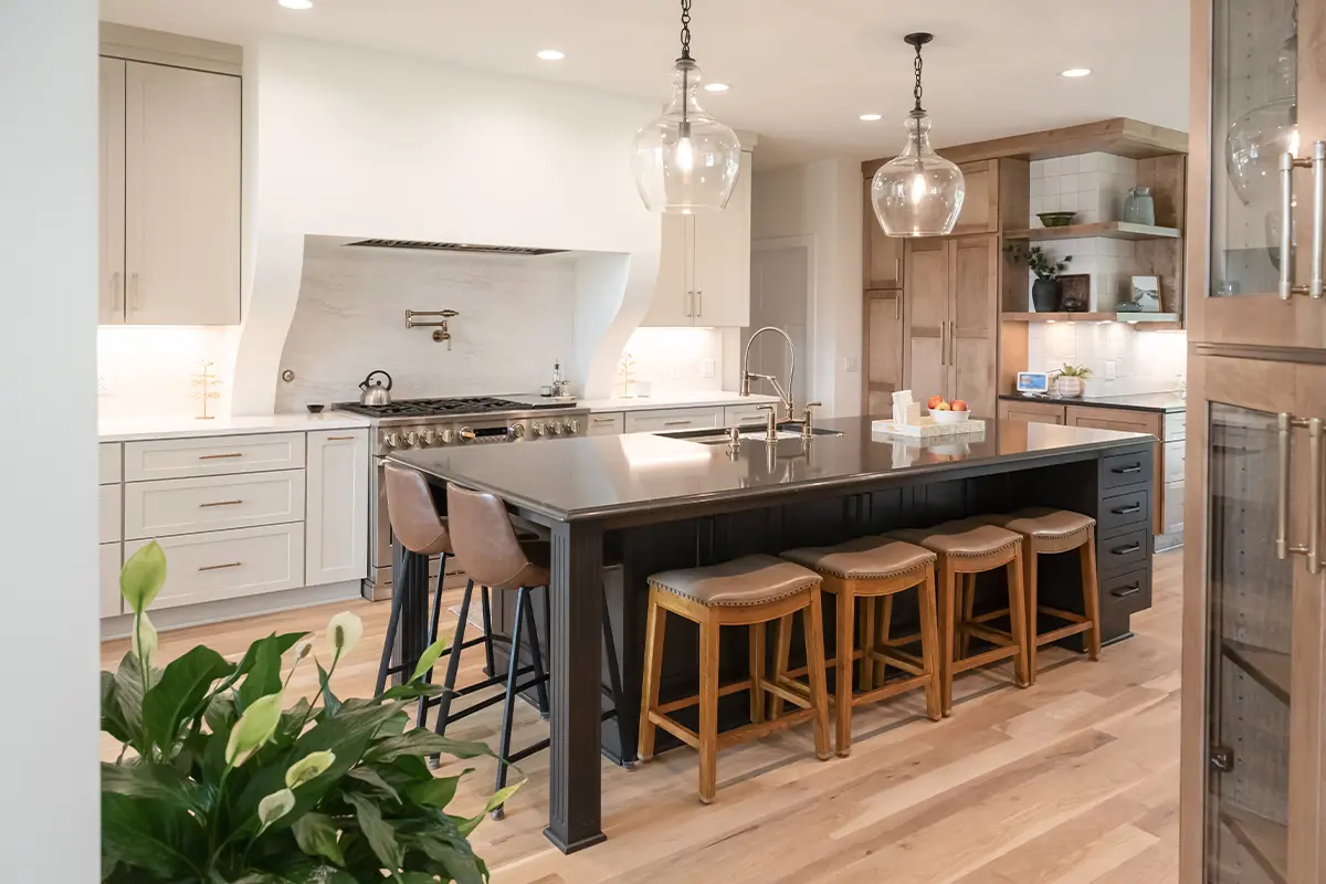
Image credit: @showplacecabinetry.com
12Matte Charcoal Cabinets – Dark and Moody Elegance
Matte charcoal cabinets are a dramatic choice for homeowners who love modern, moody interiors. They offer strong contrast while often feeling softer than a pure black finish. When surrounded by lighter stone, warm wood, and well-planned lighting, charcoal cabinetry can make a kitchen look sophisticated and architectural.
Try charcoal on a kitchen island or lower cabinets and pair it with creamy upper cabinets, light quartz countertops, and walnut shelving. Use simple cabinet hardware and avoid adding too many competing dark features. Matte finishes can show fingerprints, grease, or scuffs differently depending on the coating, so choose a durable cabinet-grade finish and check the manufacturer’s cleaning recommendations. Plan sufficient task lighting over preparation areas.
Styling tip: Charcoal + light stone + walnut is a strong combination when you want a dramatic kitchen that still feels warm.
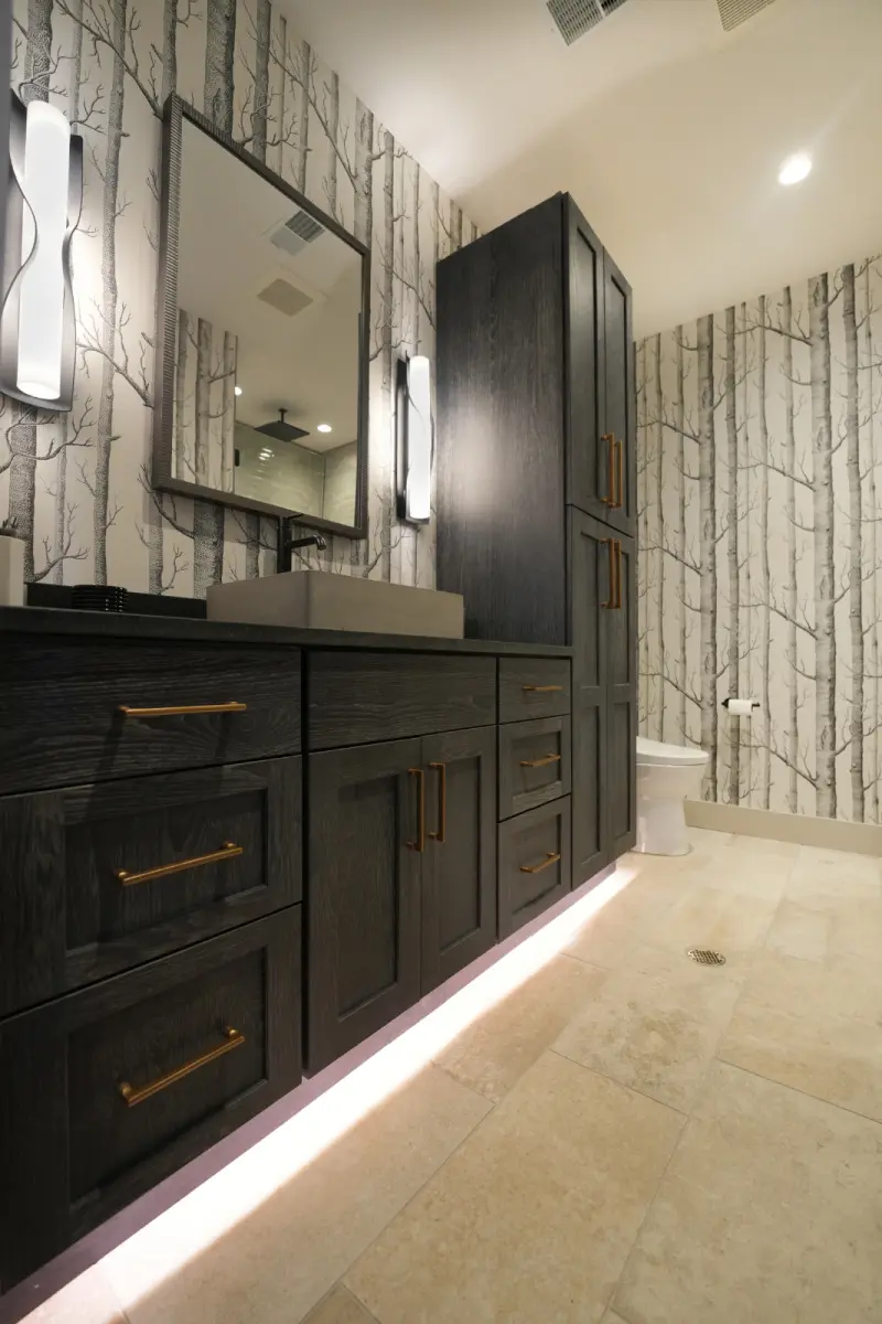
Image credit: @showplacecabinetry.com
13Two-Tone Cream and Walnut Cabinets – Beautiful Layered Contrast
Two-tone cabinetry is a wonderful way to add dimension without committing to a bold paint color throughout the kitchen. Cream and walnut are especially attractive together because the light neutral keeps the room open, while the rich wood introduces depth and texture. This combination works beautifully in modern, transitional, and European-inspired kitchens.
Try warm cream upper cabinets with walnut lower cabinets or use creamy perimeter cabinetry alongside a walnut island. Choose countertops and backsplash materials that relate to both finishes, such as warm white quartz or subtle cream stone. Keep the hardware simple and repeat the walnut tone through one or two furniture or accessory pieces. If you’re refinishing existing doors rather than replacing them, check whether the wood species and current finish can actually achieve the desired walnut appearance.
Designer tip: Two-tone cabinets look most cohesive when one finish is dominant and the second provides a deliberate accent.
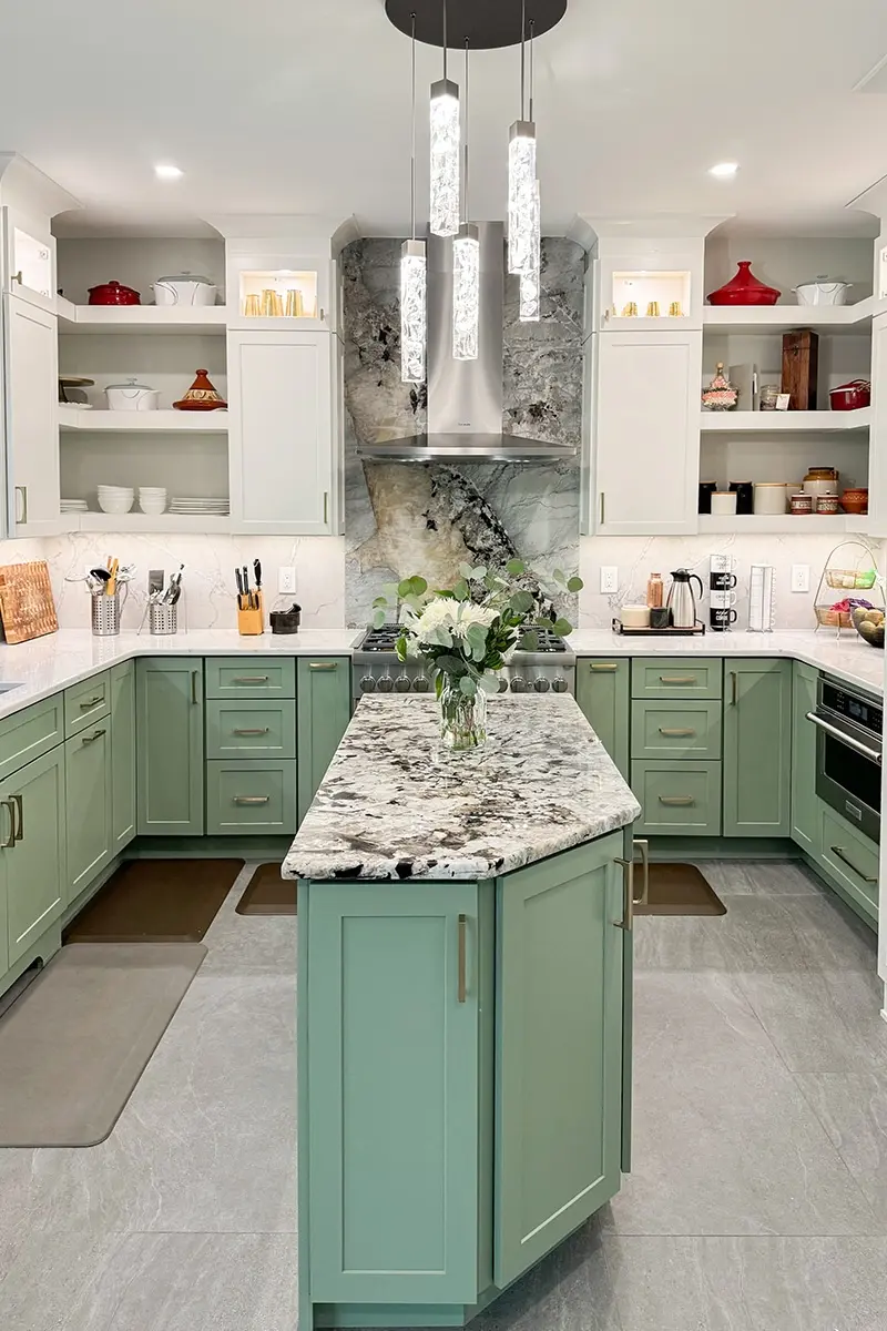
Image credit: @showplacecabinetry.com
Best Kitchen Cabinet Color Combinations to Try
Warm Neutral Kitchen
Mushroom Taupe Cabinets + Warm White Quartz + Cream Tile + Brushed Brass Hardware
Organic Sage Kitchen
Dusty Sage Cabinets + White Oak Island + Ivory Backsplash + Nickel Hardware
Classic Blue Kitchen
Navy Blue Lower Cabinets + Cream Upper Cabinets + Light Quartz + Brass Pulls
Modern Moody Kitchen
Matte Charcoal Island + Warm Greige Cabinets + Natural Walnut + Soft White Stone
Light Japandi Kitchen
Natural White Oak Cabinets + Warm White Walls + Pale Stone + Soft Black Details
How to Choose Cabinet Hardware for Each Color
Cabinet handles, knobs, and hinges can influence the finished appearance almost as much as the paint color. Simple, coordinated hardware helps cabinets look intentional and prevents the kitchen from feeling visually busy.
- Muted green-gray cabinets: Try brushed brass, polished nickel, or restrained black hardware.
- Warm greige and mushroom cabinets: Brushed brass and soft black can provide beautiful contrast.
- Light neutral cabinets: Nickel, soft brass, and simple minimal handles keep the room airy.
- Deep blue-green cabinets: Warm brass adds richness, while nickel provides a cleaner modern look.
- Navy cabinets: Brass, bronze, or polished nickel can all look elegant.
- Natural oak cabinets: Use understated hardware that doesn’t distract from the grain.
- Charcoal cabinets: Consider brushed nickel, bronze, or very simple matching dark pulls.
- Two-tone cabinets: Repeat one primary hardware finish across both colors for continuity.
Hardware tip: Measure the center-to-center distance of existing handle holes before ordering replacements. Choosing compatible hardware can save additional drilling and finishing work.
Best Cabinet Colors for a Small Kitchen
Smaller kitchens can look beautiful in both light and dark colors, but the proportions and lighting need careful consideration. If you want the room to feel open, try light greige, cream, Drift of Mist, Accessible Beige, or pale green-gray cabinetry.
If you love darker shades, use navy, charcoal, or deep green on the lower cabinets or island, then choose lighter finishes above. This creates contrast without surrounding the entire room in one deep color. Natural white oak is another excellent option when paired with simple light countertops.
Keep the backsplash, wall paint, and countertops visually connected. A small kitchen with multiple competing patterns can feel busy regardless of the cabinet color. Prioritize useful storage and uncluttered countertops for a more spacious appearance.
For additional ideas, explore these small kitchen remodel ideas that maximize space.
Should You Paint Your Existing Cabinets or Replace Them?
Painting existing cabinets can be more budget-friendly than a full replacement when the cabinet boxes, doors, hinges, and drawers are in good condition. However, a beautiful long-lasting result depends on proper cleaning, preparation, suitable coatings, and careful application.
Different cabinet materials require different approaches. Solid wood, veneer, laminate, and factory-finished surfaces don’t necessarily accept the same preparation or primer. Consult the coating manufacturer’s instructions and consider professional cabinet finishing when the existing surface is damaged, slick, or difficult to identify.
If the cabinet structure is damaged, storage is impractical, or the existing layout doesn’t work, replacement or refacing may offer better long-term value. Natural white oak or walnut finishes may also be easier to achieve through compatible wood fronts than by trying to transform unrelated wood species with stain.
Important Painting Safety Tip
Before sanding old painted cabinets, consider whether the existing coating may contain lead, particularly in older homes. Follow applicable lead-safe renovation requirements and consult qualified professionals when necessary. Use suitable ventilation, protective equipment, and manufacturer-approved cabinet coating products.
How to Test Kitchen Cabinet Paint Colors Before Committing
- Choose three or four candidates: Compare a manageable number of colors rather than dozens of similar shades.
- Use large sample boards: A small paint-chip square may not show how the color behaves across a large cabinet area.
- Check the actual cabinet surface: Existing finishes and primers may affect the final coating result.
- Compare with the countertop: Watch for clashing warm and cool undertones.
- Look at the backsplash: Tile can make a cabinet color appear lighter, darker, warmer, or cooler.
- Observe at different times: Natural daylight and kitchen bulbs can change your perception of a color.
- Test the sheen: Matte, satin, and semi-gloss finishes reflect light differently and have different maintenance requirements.
- Consider the adjoining rooms: Open-plan kitchens look better when the cabinetry connects with nearby flooring and furnishings.
- Review practical maintenance: Dark and light finishes may show fingerprints, crumbs, and splashes differently.
- Confirm coating compatibility: Follow the paint manufacturer’s preparation and application guidance for your cabinet material.
Common Kitchen Cabinet Color Mistakes to Avoid
Choosing a Color Only From Online Photographs
Phone screens, editing, sunlight, and photography can change how paint colors appear. Always test physical samples in your own kitchen before ordering paint or finished cabinetry.
Ignoring Existing Countertop Undertones
A warm mushroom cabinet color may not coordinate with every cool white countertop. Compare samples side by side and choose finishes that relate to each other.
Using Too Many Cabinet Colors
Multiple shades can make the kitchen feel visually busy. For a two-tone design, choose one dominant finish and one complementary color or wood tone.
Forgetting How Lighting Changes Color
A pale green-gray may appear noticeably different under warm bulbs than in daylight. Evaluate your chosen color in the actual lighting conditions of the room.
Choosing a Finish Unsuitable for Cabinet Doors
Wall paint isn’t automatically suitable for busy cabinet surfaces. Choose an appropriate cabinet coating and follow the manufacturer’s recommendations for adhesion, curing, and cleaning.
Using Dark Colors Without Enough Task Lighting
Deep navy, charcoal, and blue-green can look beautiful, but adequate lighting is still important for cooking and food preparation. Plan task lights and general illumination as part of the design.
Mixing Too Many Hardware Finishes
An assortment of brass, chrome, black, copper, and nickel can distract from your cabinet color. Keep one main metal finish and introduce a second only when it feels intentional.
Following a Trend That Doesn’t Suit Your Home
The best cabinet color should connect with your flooring, countertops, lifestyle, and preferred decorating style. A popular color isn’t automatically the right choice for every kitchen.
Frequently Asked Questions About Kitchen Cabinet Colors
What kitchen cabinet colors are trending in 2026?
Warm greige, mushroom taupe, muted sage, rich navy, natural wood, matte charcoal, and two-tone cabinetry are prominent directions in 2026 kitchen design. These finishes emphasize warmth, texture, and personal style.
What cabinet color makes a small kitchen look brighter?
Warm white, light greige, Accessible Beige, Drift of Mist, and pale green-gray are attractive choices for compact kitchens. Good lighting, connected surfaces, and uncluttered countertops also influence how open the room feels.
Are white kitchen cabinets going out of style?
White cabinets remain a classic choice. However, warmer whites, layered neutral tones, and natural wood accents are appealing alternatives to an entirely bright white kitchen.
Which cabinet colors work best with wood floors?
Warm greige, cream, muted sage, navy, and charcoal can all coordinate with wood floors. The best option depends on whether the flooring has yellow, red, brown, or gray undertones, so compare samples directly.
Should kitchen upper and lower cabinets be the same color?
They can be, but they don’t have to be. Matching cabinetry creates a cohesive appearance, while two-tone designs with light uppers and darker lowers can introduce beautiful contrast. Choose the arrangement that best suits your kitchen layout and overall palette.
Final Thoughts: Choose a Kitchen Cabinet Color That Feels Like Home
A new cabinet color can make a kitchen feel brighter, warmer, more sophisticated, or more personal without changing the entire layout. Whether you’re drawn to the quiet beauty of greige, the gentle character of sage, the richness of navy, or the warmth of natural oak, there are plenty of beautiful directions to explore.
Use these 13 trending kitchen cabinet colors as inspiration, then narrow your choices according to your existing surfaces and available light. Test samples carefully, choose durable finishes, and coordinate your hardware, countertops, and backsplash. The best kitchen cabinet color isn’t simply the most fashionable one. It’s the shade that brings your whole kitchen together and makes the space feel welcoming every day.