
While you might have the best handwriting on paper, we can’t necessarily make the same statement for your digital handwriting.
All your straight cursive lines can go all wobbly and wonky when on screen.
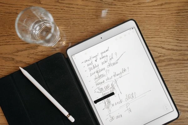
We do have apps, and means that can help get you writing straight.
But in this article, we have tips and tricks that will help make your writing more beautiful.
Easy Tips to Make Your iPad Handwriting Look Better
1. Use a Matte Screen Protector
Typing on glass feels slippery and unnatural. A matte screen protector (like Paperlike or Bersem) adds texture to your iPad screen, simulating the feel of paper.
This texture creates just the right amount of resistance between the Apple Pencil and screen, which gives you better control over your strokes and curves. It reduces shakiness and improves the precision of your writing.
How to do it: Choose a high-quality matte screen protector specifically designed for note-taking or drawing. Once applied, you’ll instantly feel a difference in pen grip and handwriting flow.
2. Choose the Right Stylus Settings in Your Note-Taking App
Apps like Goodnotes and Notability offer multiple pen types (ballpoint, fountain, brush) and thickness levels. Not all pens suit all writing styles.
You might find your handwriting looks neater with the ballpoint pen at medium thickness and slight pressure sensitivity turned on. Experiment with these options to find what mimics your natural writing flow.
Tip: Use a darker ink color for better visibility, and avoid using too-thick strokes as they can make your handwriting look bulky or uneven.
3. Use Guideline Templates to Practice Spacing and Slant
Digital planners and notes often come with dotted or lined backgrounds. These help maintain consistency in your letter size, baseline alignment, and spacing.
Writing without guidelines can make your letters float or slant unevenly. Using them as training wheels improves muscle memory.
How to do it: Turn on grid, ruled, or dotted paper in your app settings. Try writing between two lines to keep a steady height and use slanted guides if you want cursive or sloped writing.
4. Slow Down Your Writing
The number one mistake people make when handwriting on iPad is writing too fast. Unlike pen and paper, your Apple Pencil doesn’t respond the same way to speed. Quick strokes lead to squiggly lines and unreadable loops.
Slowing down not only helps your brain focus but also allows your hand to move with control. Practice by writing simple alphabets slowly, then try full sentences. Soon, you’ll notice your writing looks smoother and more intentional.
5. Practice with Letter Drills and Words Daily
Repetition builds fluency. Just like practicing cursive in school, working on individual letters and tricky connections daily can dramatically improve your flow. Spend 10 minutes a day practicing alphabet drills, words, or your planner entries slowly and neatly.
Over time, your handwriting becomes more muscle-driven and natural. Apps like Procreate or digital calligraphy sheets can also help build a consistent style.
6. Check Your Posture and Grip
Handwriting isn’t just about your fingers—it’s a full-hand and upper body activity. Slouching or twisting your wrist can make your lines shaky and inconsistent. Sit with a straight back, relaxed shoulders, and your wrist hovering gently above the iPad.
Hold your Apple Pencil lightly—not too tight—to prevent fatigue or cramps. Try positioning the iPad at a comfortable angle, or use a stand if needed to reduce wrist strain.
7. Develop a Consistent Handwriting Style
Instead of trying to mimic fancy Instagram calligraphy, aim to develop your own consistent style. Whether it’s loopy, rounded, print, or cursive—what matters is that it’s repeatable.
Pick 2–3 font references or samples and use those as inspiration. Once your muscle memory kicks in, your writing will start looking clean and intentional.
Consistency helps make even imperfect handwriting look beautiful over time.
8. Zoom In While Writing
Zooming in gives you more control, especially for small-sized text like planner entries or headers. When your letters are larger, you can manage curves and connections more smoothly. After writing, you can zoom out and everything looks neat and sharp.
This technique also helps reduce shakiness and jagged edges in your writing. Most apps like Goodnotes let you zoom with two fingers or use a magnified writing box for precision.
9. Use Color Coding and Highlighters
Color makes your notes visually appealing and easier to read. Use 2–3 complementary colors for titles, headers, and categories. Don’t overdo it, though—too many colors can look messy. Also, use pastel highlighters to add contrast without overwhelming your writing.
Pro tip: Save a custom color palette in your app for quick access and consistent design.
10. Clean Up Your Handwriting with the Lasso Tool
The lasso tool is your best friend for correcting mistakes. If something looks off—maybe a title is crooked or the spacing is weird—just select it with the lasso tool and move, resize, or rotate it. You can also copy/paste recurring headings or neaten up your daily planner sections this way.
Use this tool often to polish your pages after you’ve written freely.
11. Use Calligraphy and Brush Pen Settings for Headings
For headers or important sections, switch to a brush pen with pressure sensitivity. This adds personality to your pages and makes your planning visually engaging. With practice, you can even learn faux-calligraphy techniques where you thicken your downstrokes manually.
Start by using bold brush strokes only for headings—this helps separate them from regular text and makes your notes easier to scan.
12. Be Patient and Practice Regularly
Improving your digital handwriting doesn’t happen overnight. Set realistic goals and track your progress weekly. Write affirmations, journal entries, or planner spreads every day to stay consistent. Celebrate small wins—like nailing your capital “G” or perfecting your spacing.
Remember: Digital handwriting is a skill, not a talent. With dedication, even messy writers can create beautiful notes.
13. Explore Handwriting Fonts for Inspiration
If you’re unsure what kind of handwriting style suits you, look up handwriting fonts online for visual reference. These can help you practice neatness, letter spacing, and flow. Try copying fonts like “Hello Honey,” “Montserrat Script,” or “Notera.”
Once you find a style you like, emulate it in your practice sessions until it becomes natural.
14. Declutter Your Page Layout
Too much content per page can make even neat handwriting look messy. Break your notes or planner sections into digestible chunks. Add space between lines, use boxes or dividers, and avoid cramming too much info in one spot.
A clear layout enhances the beauty of your writing and helps with overall focus.
15. Use Pre-Made Digital Planning Templates
Instead of creating everything from scratch, try pre-designed digital planner templates. These come with aesthetic layouts, guides, and sections already in place. You can focus on writing neatly within the structure instead of designing your pages from zero.
Many platforms (Etsy, Notion, Pinterest) offer free or premium options that suit different planning styles.
See Also:
-
Actionable Tips to Grow Instagram Followers Quickly (Especially for Beginners)
-
100 Aesthetic, Funny, Short Gen Z Quotes (Life, Deep, Humor)
There’s no handwriting that can’t be fixed.
Thus, this article is a perfect help to everyone who wants to improve their writing style.
Hope you find this article informative.


